Summary
A visual system emphasizing motion, clarity, and trust through geometric structure and color.
Client
Mpoikos (Boikos) Haulage
Scope
Visual Identity · Logo Design · Typography · Color System
Location
Corfu, Greece
Year
2020
The Challenge
The task was to redesign the company’s visual identity to better reflect its longstanding presence while aligning with modern expectations in the transportation industry. The new identity needed to communicate professionalism, efficiency, and movement without detaching from the company’s heritage and trust within the local market.
The Brand
Boikos Haulage is a transportation and trading company based in Corfu, Greece, with over five decades of activity in the logistics sector. Family-run since its inception in 1970, the company has built a strong local presence grounded in reliability, speed, and customer-first service.

Design Approach
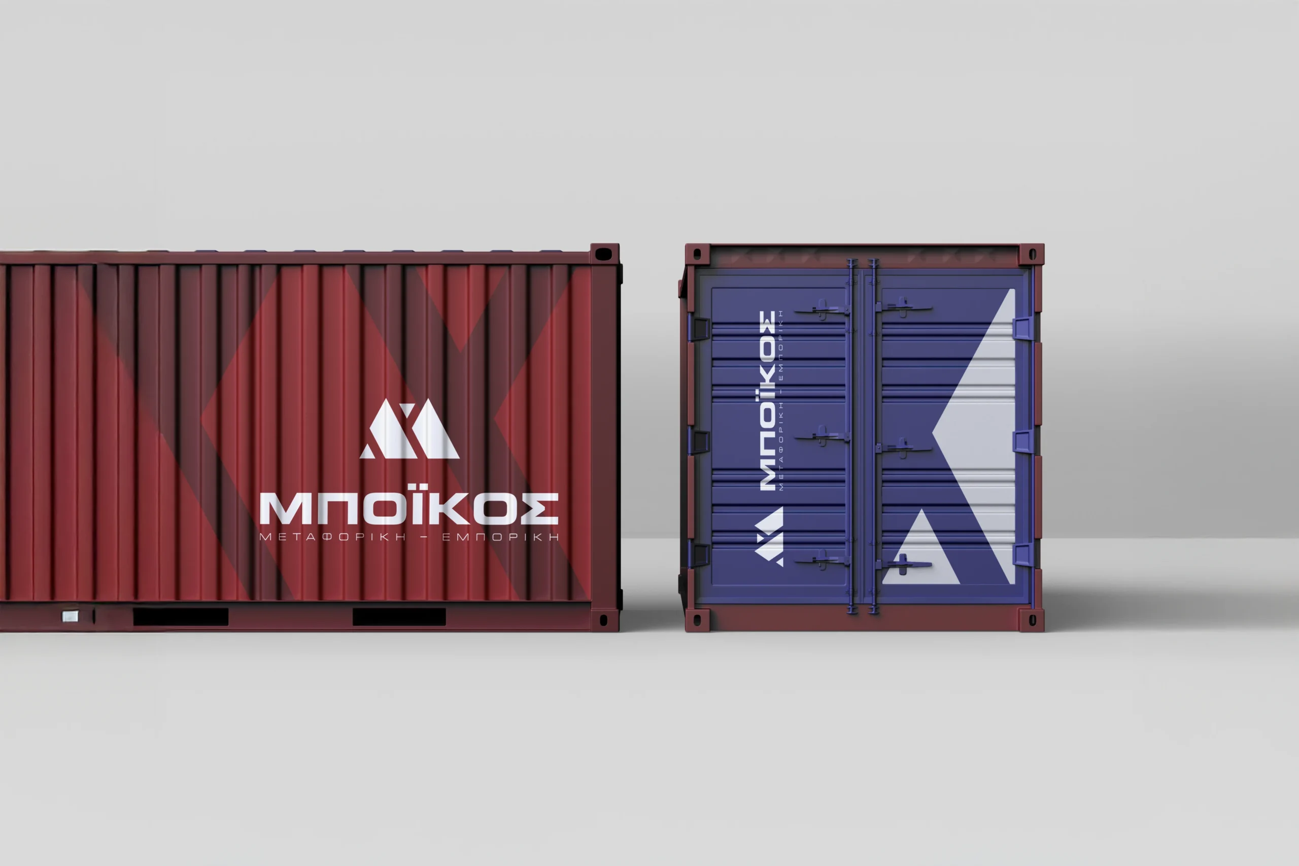
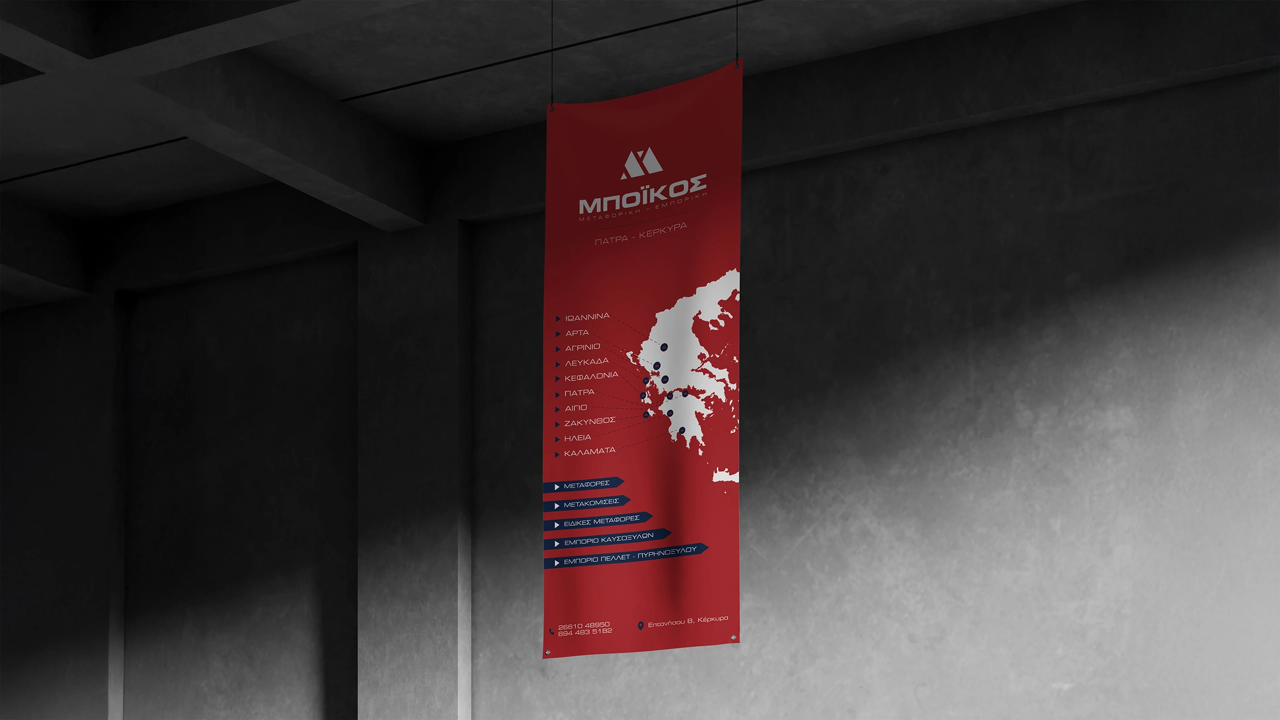
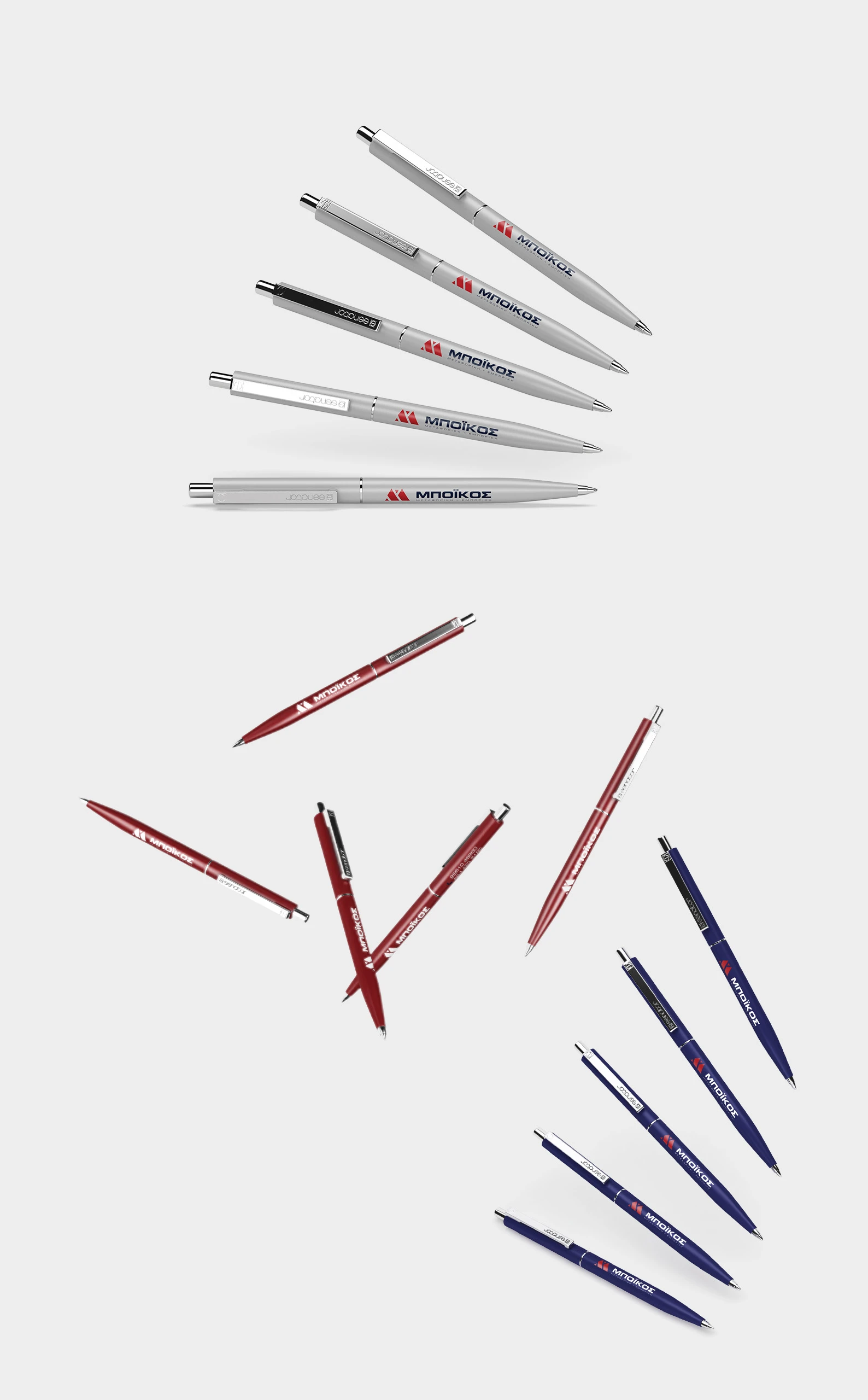
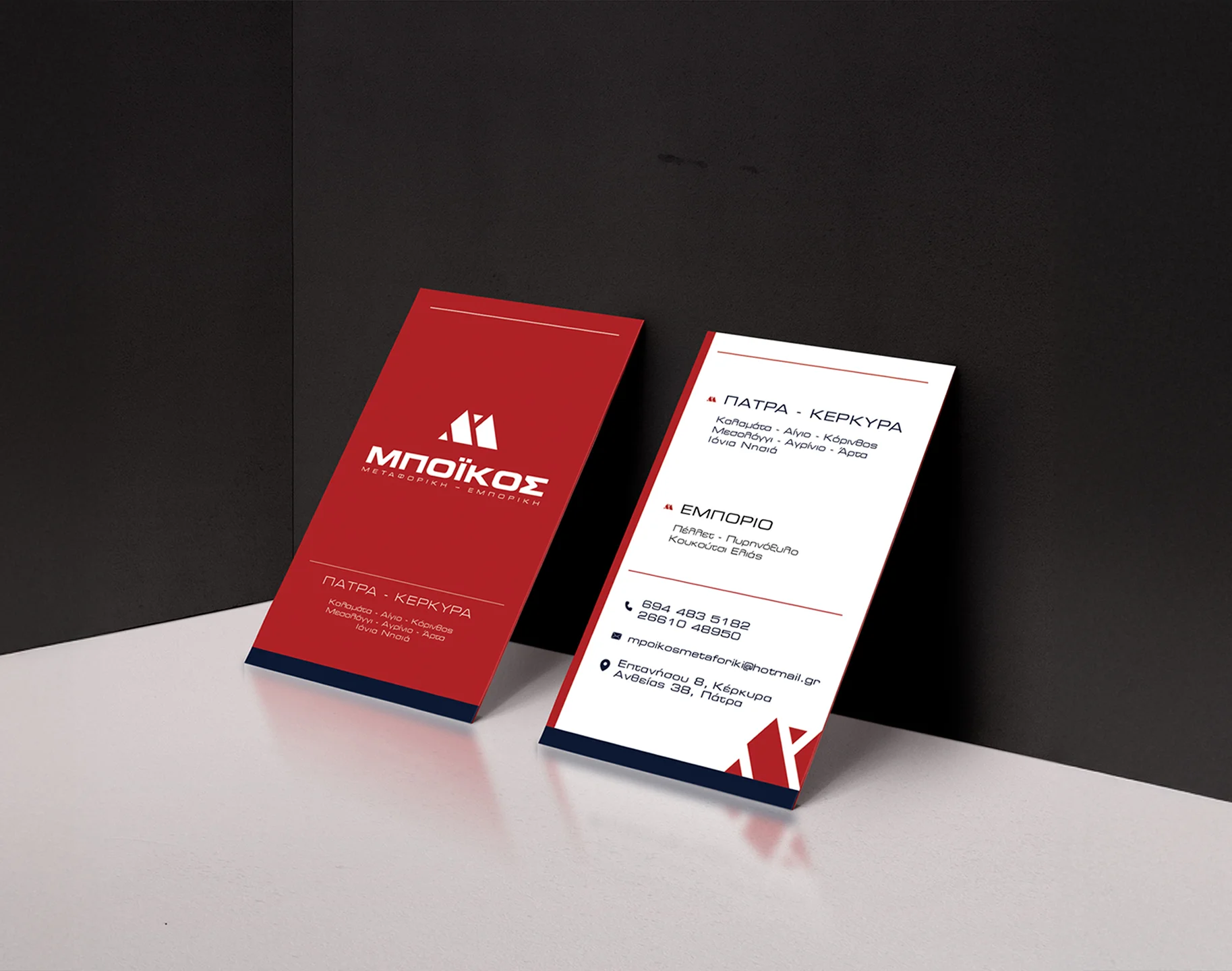
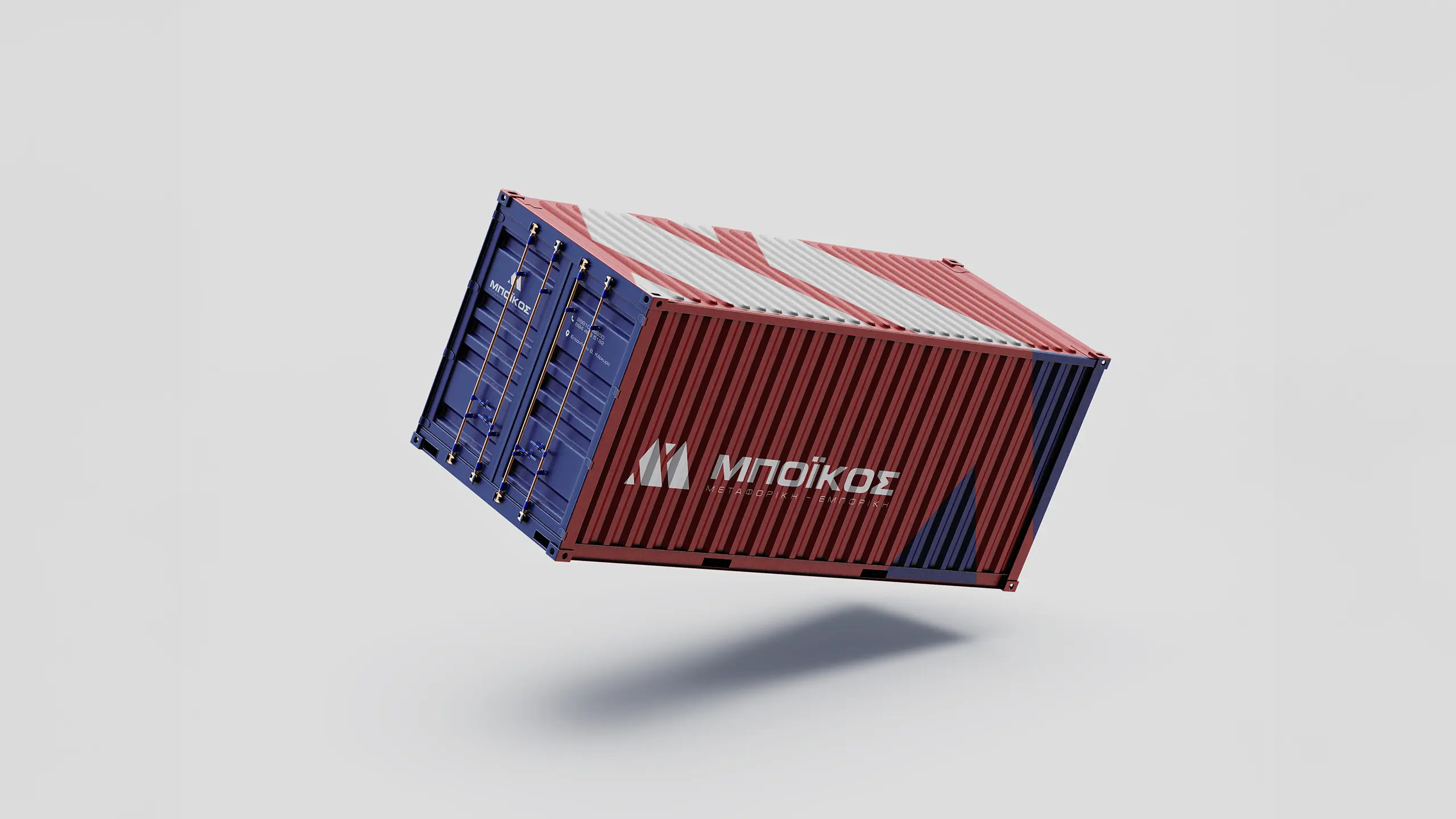
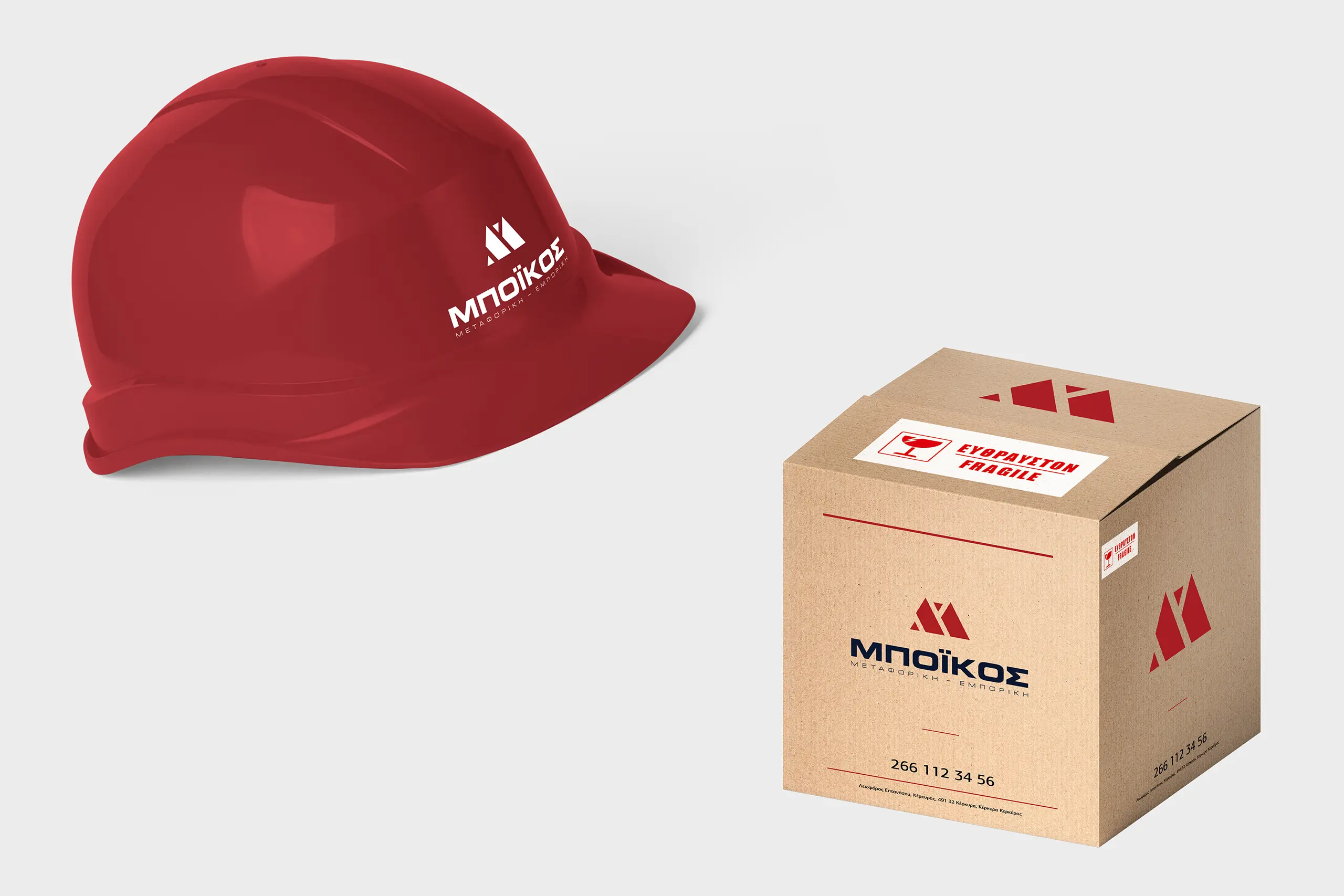
The identity is built around a bold geometric monogram representing the letter “M”, referencing the word “Metaforiki” (Transport). The symbol is constructed from two parallel parallelograms suggesting roads, direction, and motion reinforced by clean angular forms inspired by trade symbols.
The form evokes progress and structure while remaining grounded and legible. The system is supported by a confident, modern typeface that mirrors the strength of the mark and contributes to a cohesive, no-frills visual system.
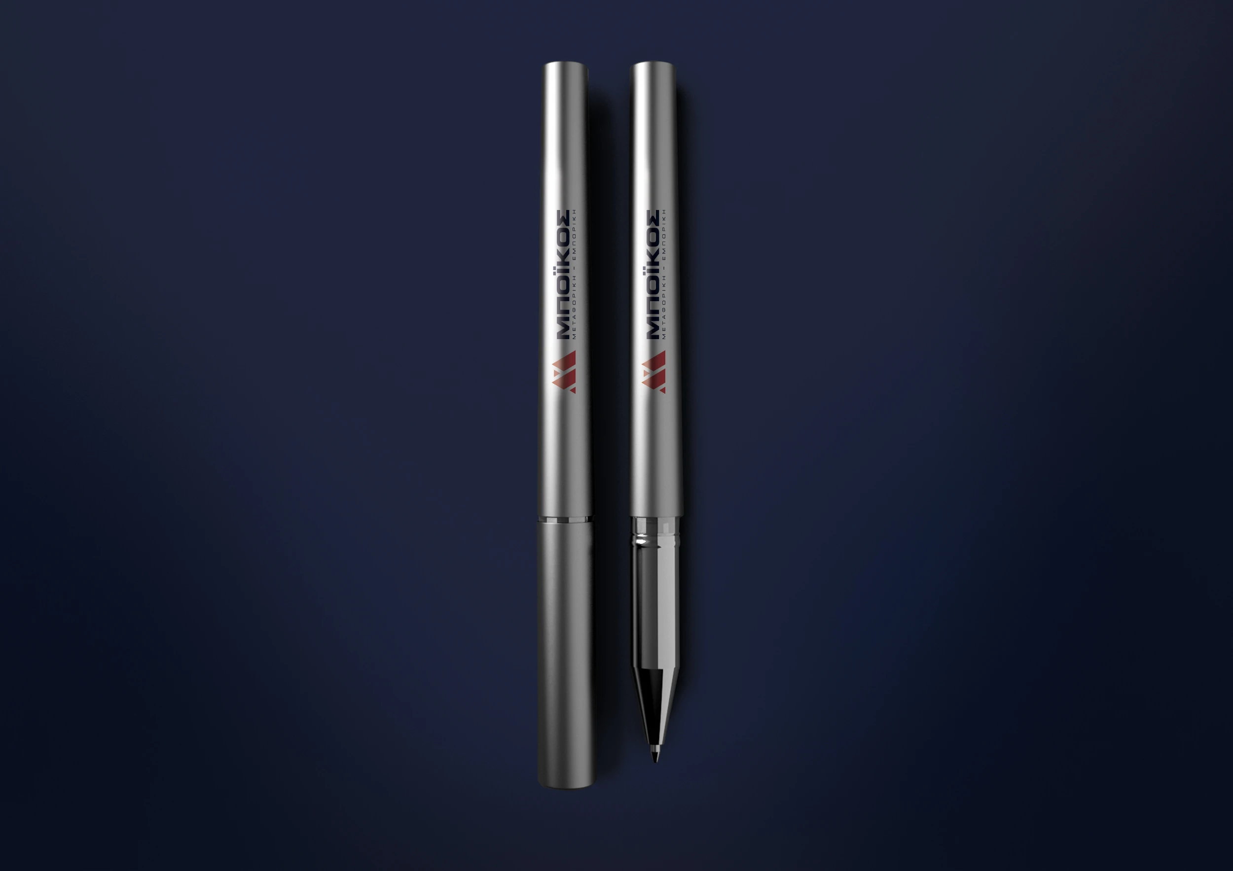
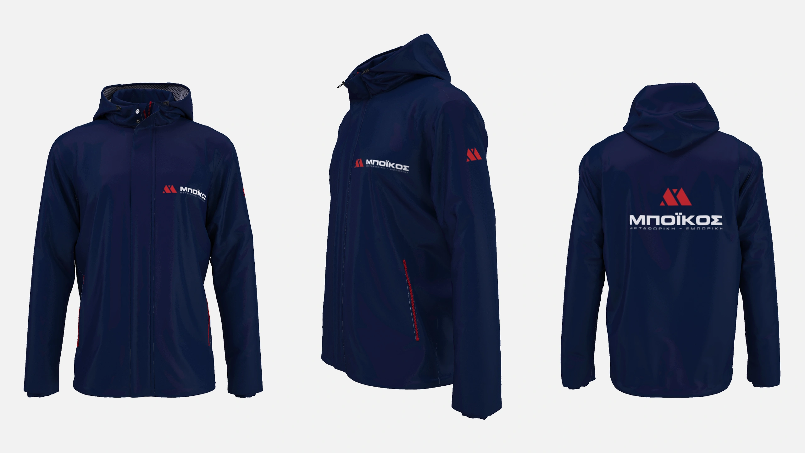
The goal was to create a mark that could stand confidently across applications from vehicle signage to printed materials while remaining simple, memorable, and instantly recognizable.
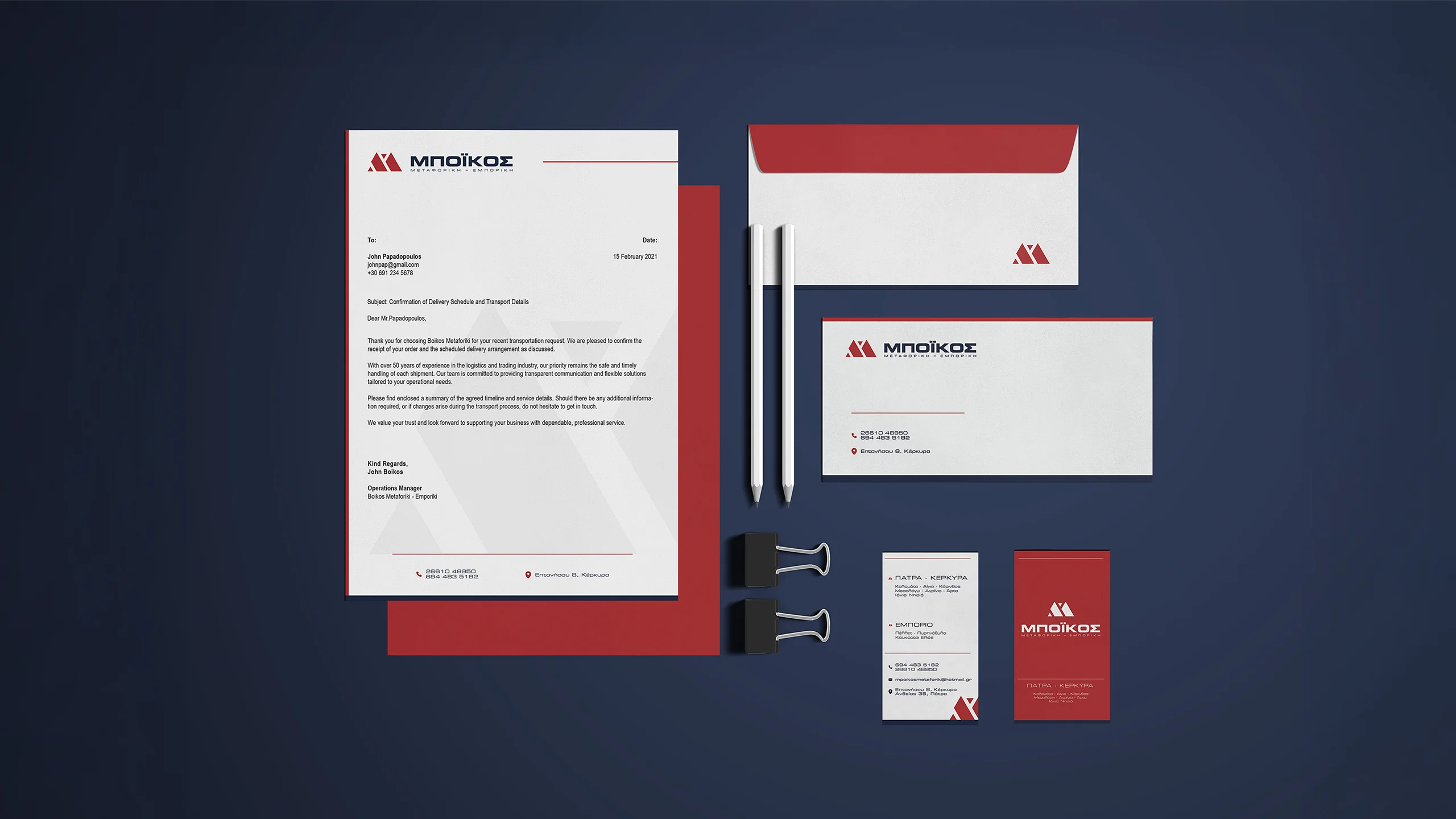
Color System
The chosen palette draws from a combination of deep red and navy blue, selected for both contrast and meaning:
- Deep red captures speed, urgency, and energy core attributes of a responsive logistics provider.
- Navy blue introduces balance, trust, and professionalism anchoring the palette with a sense of dependability.
The result is a dynamic yet grounded system that aligns with the company’s operational identity.
Outcome
The final identity delivers a clear and contemporary visual language, reflecting Boikos’ evolution while staying true to its core values. Designed to be functional and bold, the system offers consistency across all communication points, reinforcing the company’s reputation in Corfu and beyond.


/ Related Projects