Summary
Modern identity for a leading orthopaedic surgeon, reflecting trust, expertise, and forward-thinking care.
The Challenge
The client had an outdated, template-based logo and was seeking a refreshed identity that better reflected his standing in the medical field. The goal was to create a modern and professional visual system that communicates both clinical expertise and a sense of human care.
The Client
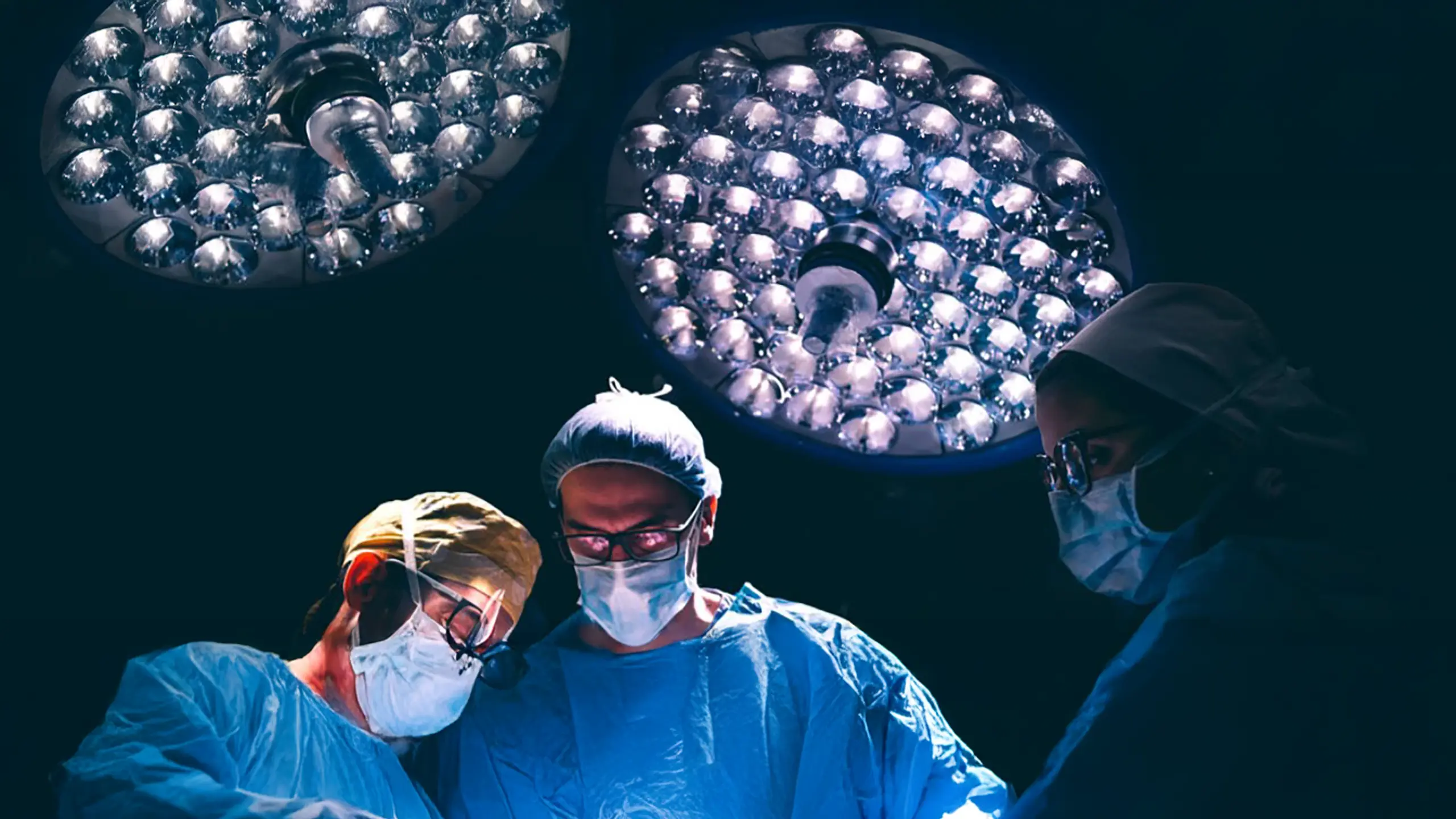
Dr. Nikolaos Roidis is a distinguished orthopaedic surgeon based in Athens, with international experience and leadership roles in both private and public healthcare. Specializing in robotic joint replacement and advanced orthopaedic techniques, he is widely recognized for his precision, innovation, and patient-focused approach.

Design Approach
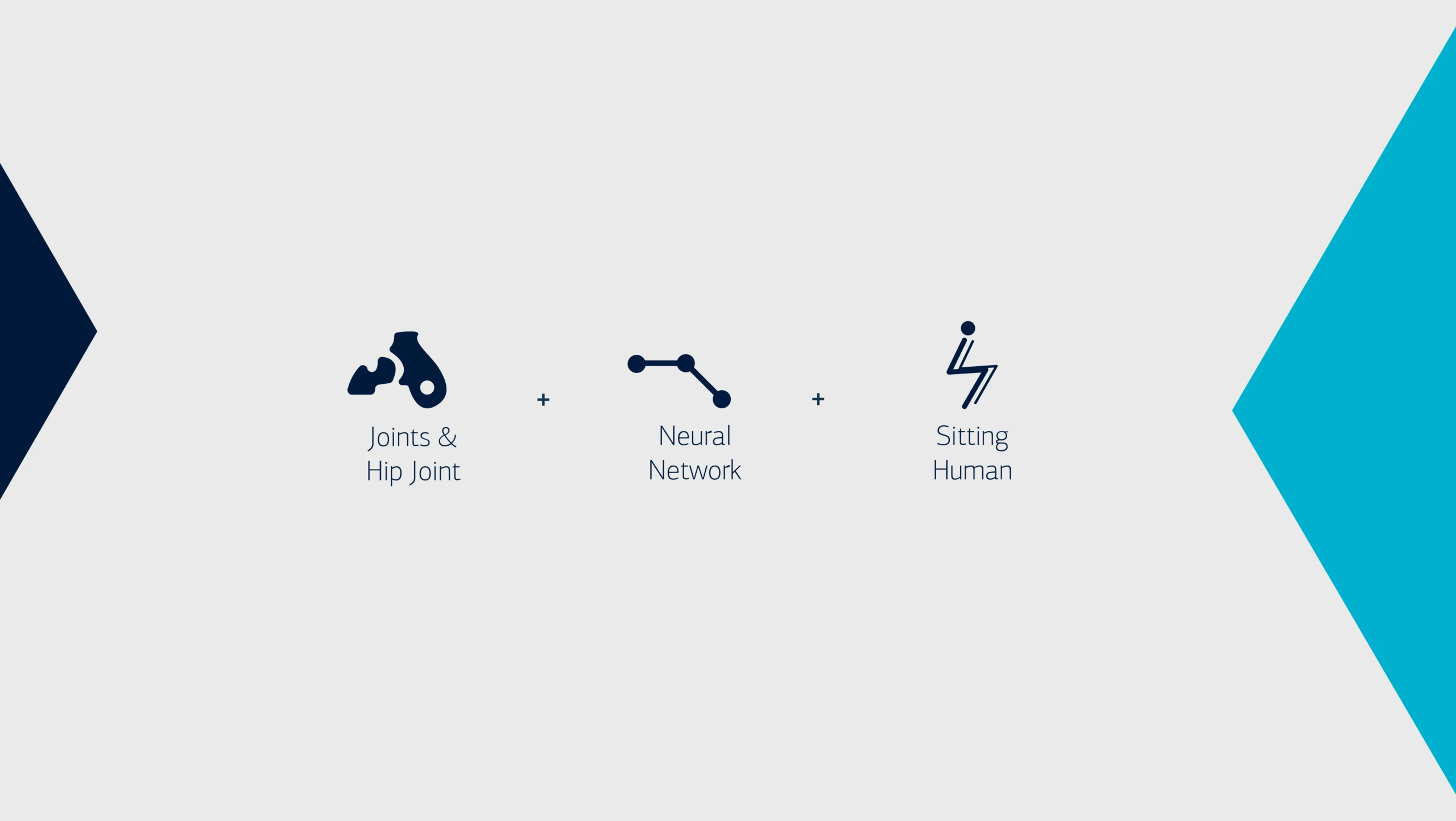
The new identity is built around a stylized symbol inspired by the seated human form, suggesting postural balance and musculoskeletal alignment central elements in orthopaedic care.
The internal structure of the symbol draws from neural networks, referencing both medical science and technological advancement. Rounded contours and soft curves introduce approachability, while the italic slant conveys energy, precision, and forward motion echoing the surgeon’s use of robotic procedures and fast-track recovery protocols.
A clean, structured typeface was chosen to reflect clarity, professionalism, and stability.
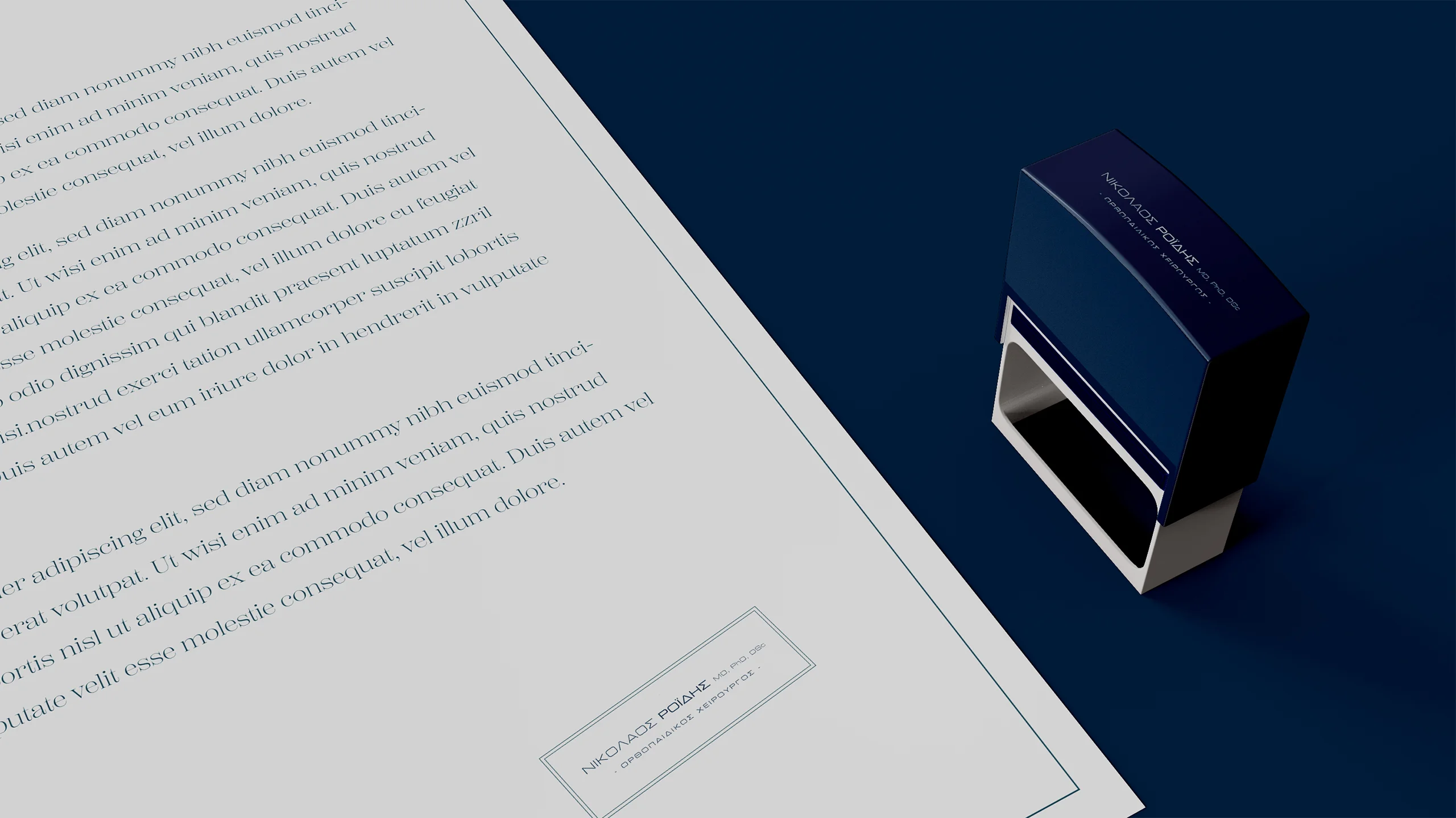
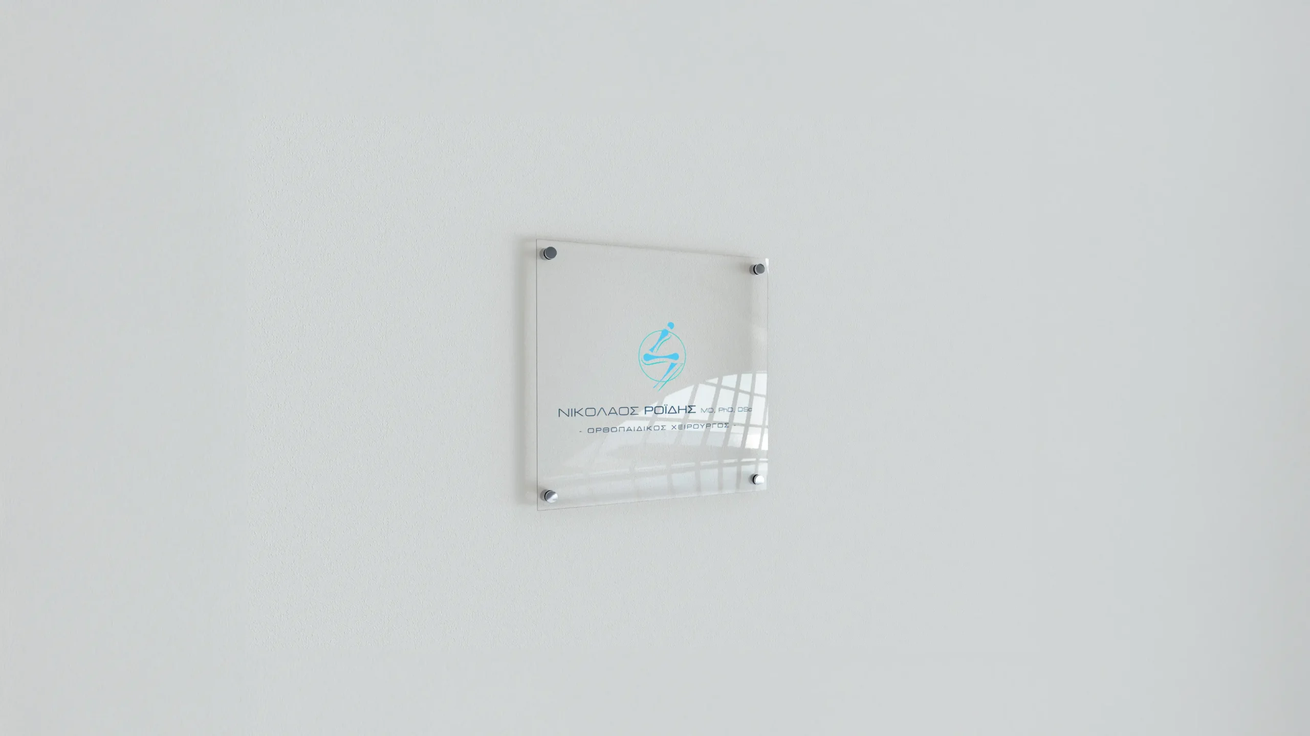
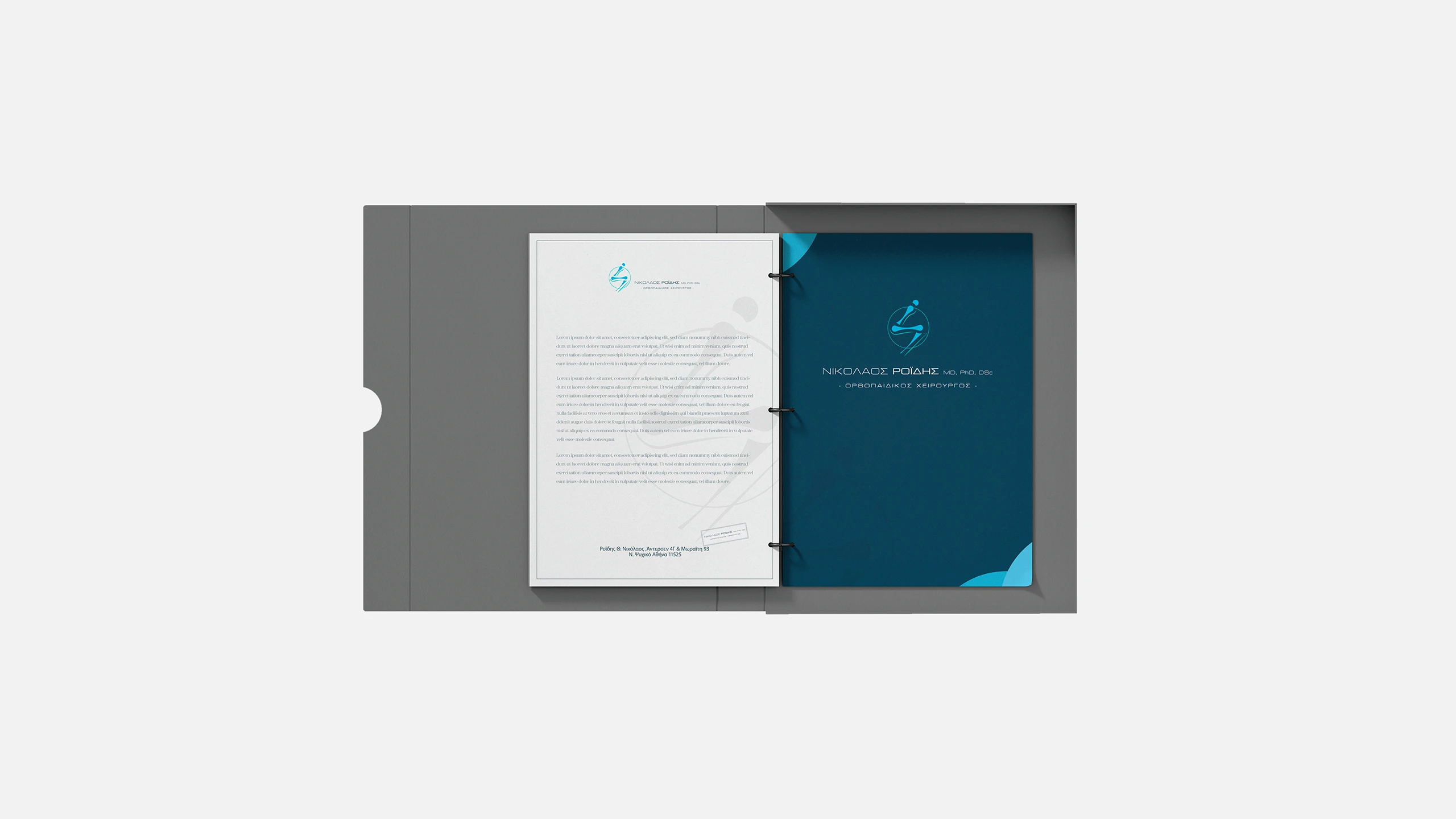
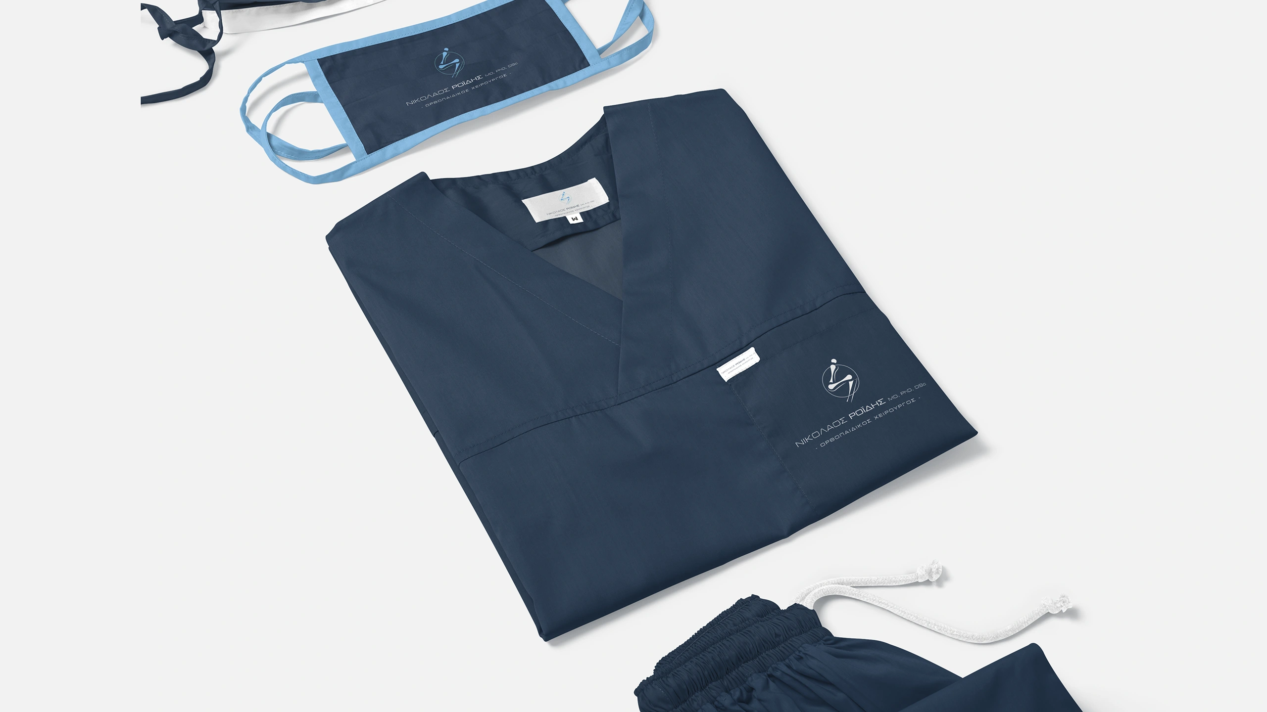
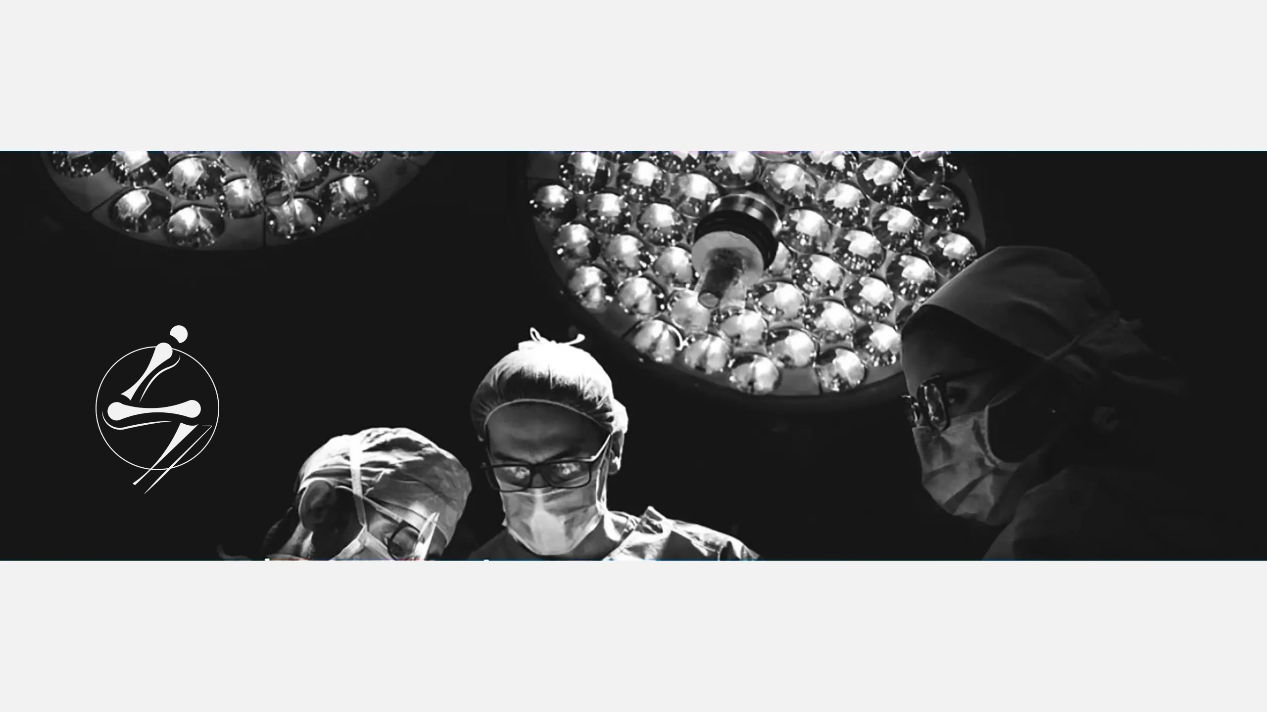
The identity was implemented across key applications including stationery and clinic signage, and was also animated into a custom logo reveal for use in the client’s presentation videos.
Color System
The visual language is supported by a restrained yet intentional color palette. Core shades of clinical blue establish a sense of trust and professionalism, while soft complementary tones introduce warmth and accessibility striking a balance between medical precision and human-centered care.
Outcome
The visual identity has been successfully integrated into the doctor’s digital presence and presentation materials, supporting a cohesive and professional public image aligned with his practice.
/ Related Projects