Summary
Modern stationery system for PS Glass, designed to convey clarity, structure, and visual consistency across all corporate materials.
Client
Scope
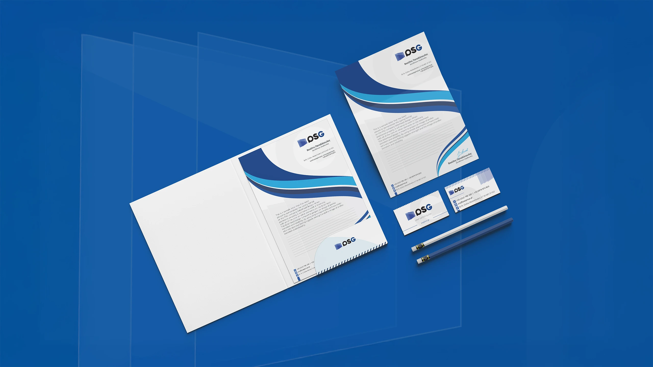
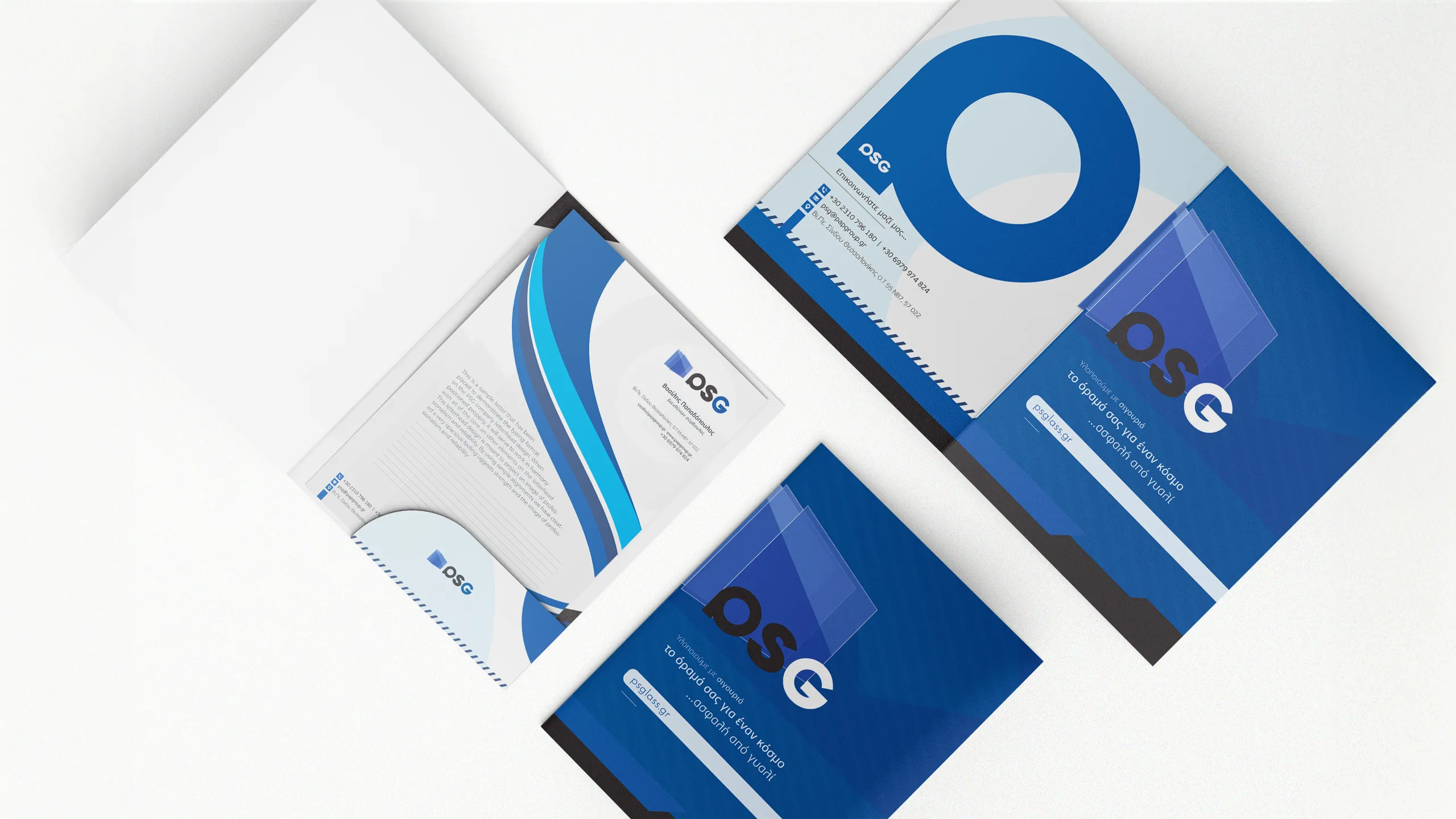
Letterhead
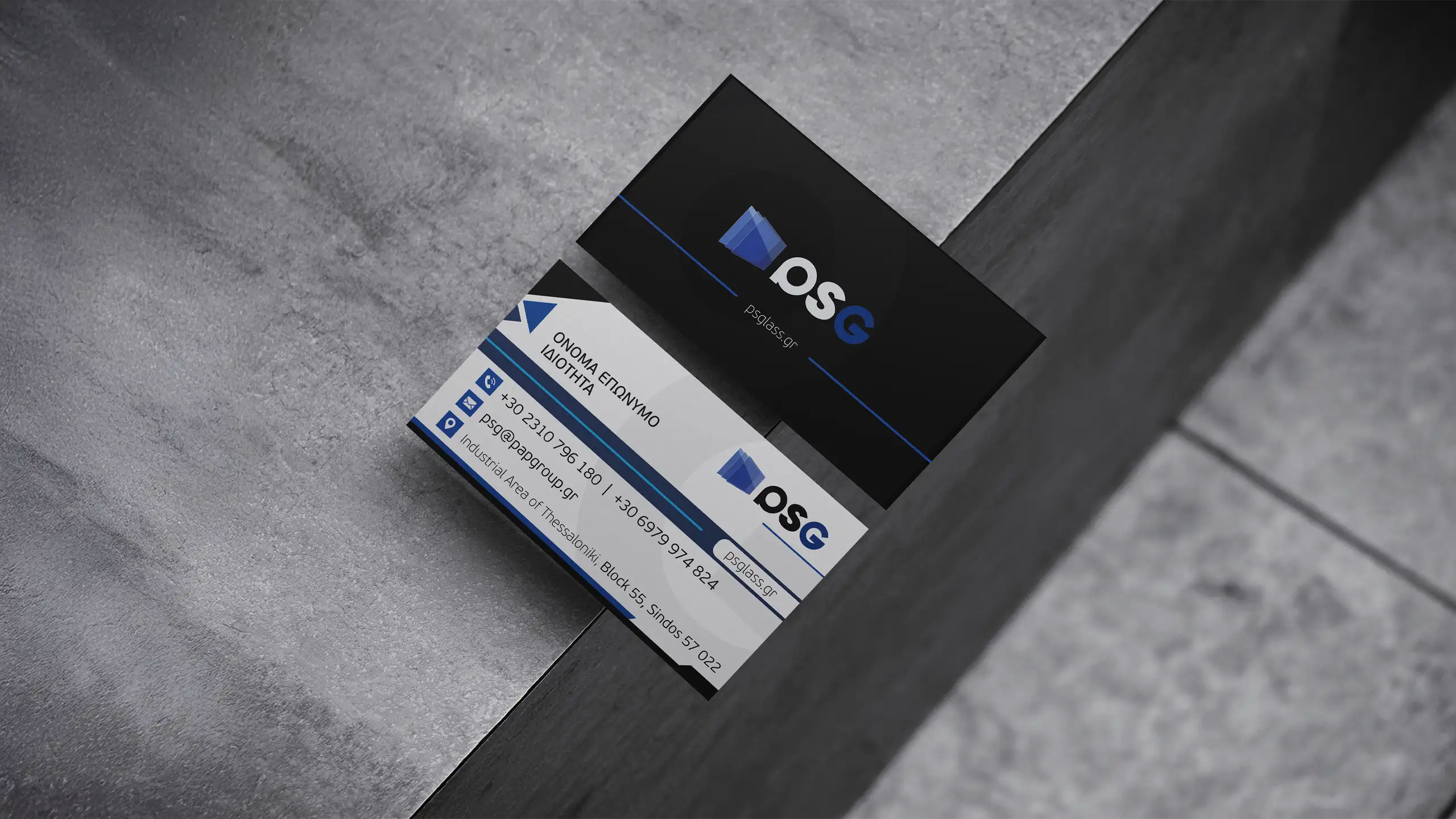
Business Cards
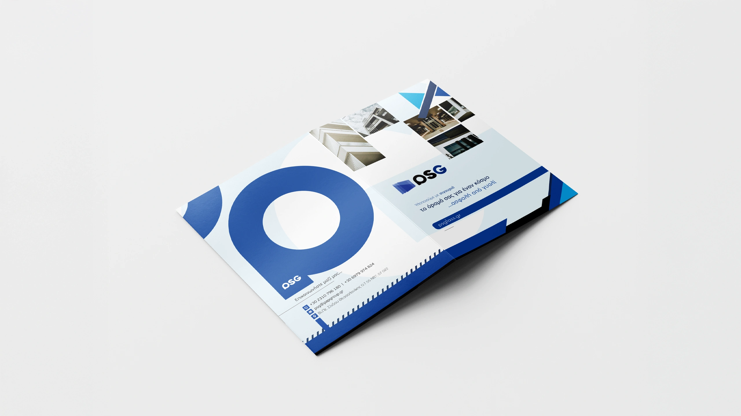
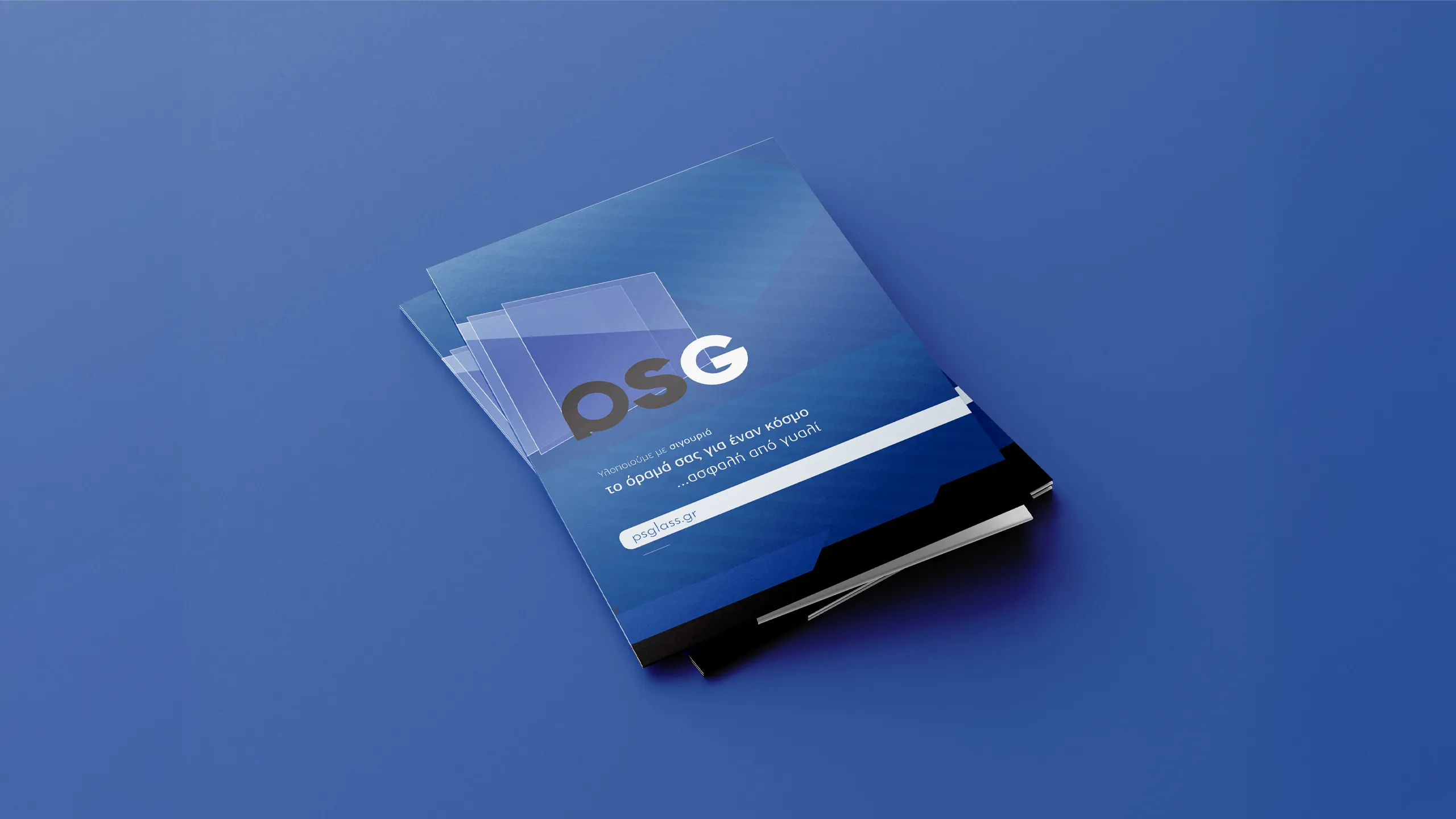
Presentation Folder Design
Location
Thessaloniki, Greece
Related
Stationery
Year
2023
The Challenge
The task focused on modernizing the company’s printed materials to reflect a more refined and consistent visual identity. While the existing logo remained the foundation, the need was for a complete aesthetic upgrade that would bring cohesion across all stationery and enhance the perception of professionalism.
The Brand
PS Glass is a glass systems company based in Thessaloniki, Greece, specializing in high-quality architectural glass applications. With a strong presence in both residential and commercial markets, the company delivers precision-engineered glass solutions, combining innovation with safety and aesthetics.
Design Approach
The design direction was guided by visual cues extracted from the company’s logo color palette, structure, and tone. These elements informed the overall layout, shapes, and typographic treatment of the stationery suite.
The presentation folder served as a key brand touchpoint, incorporating design elements from the logo along with photographic references of completed installations. This combination reinforced both the visual identity and the company’s real-world results.
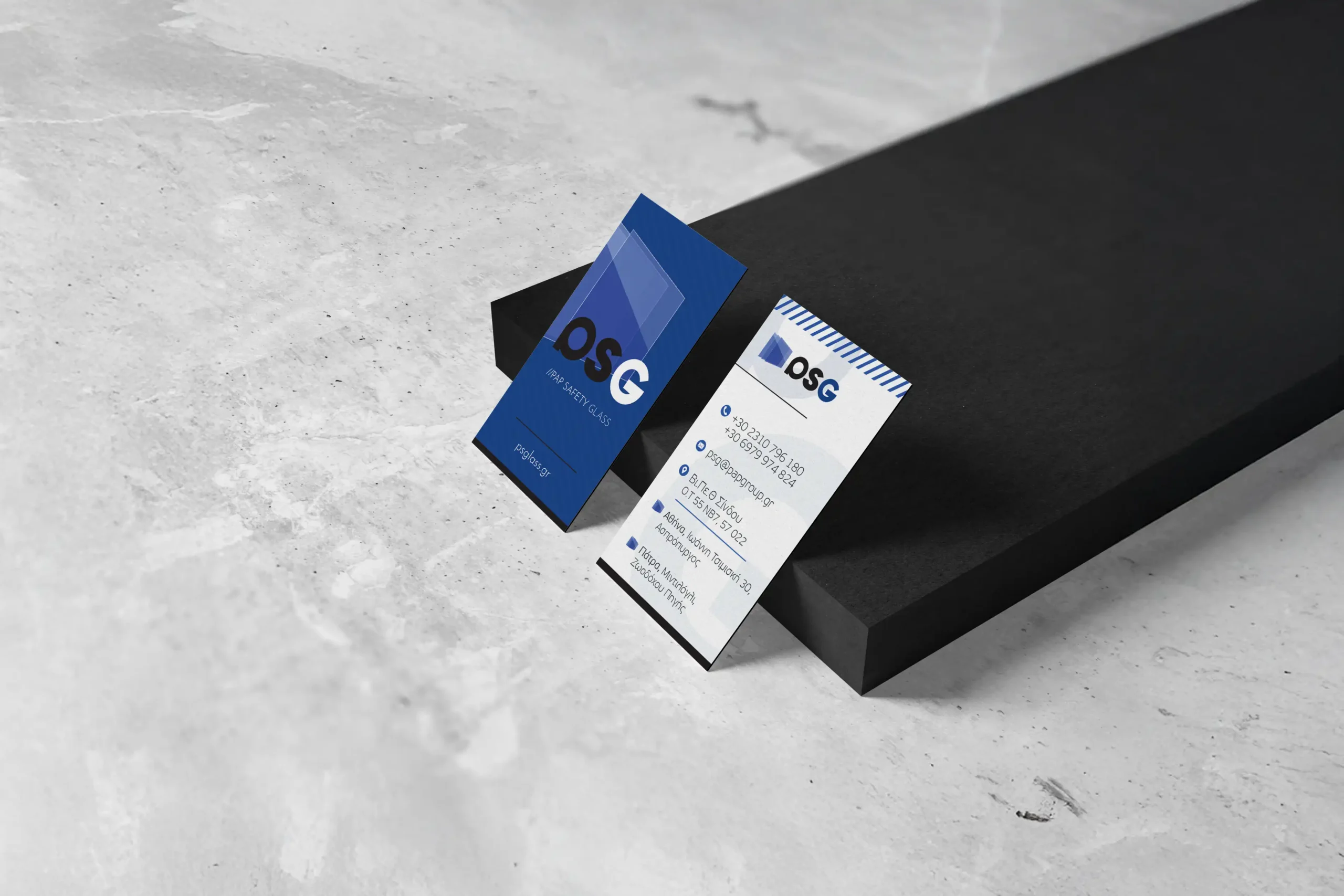
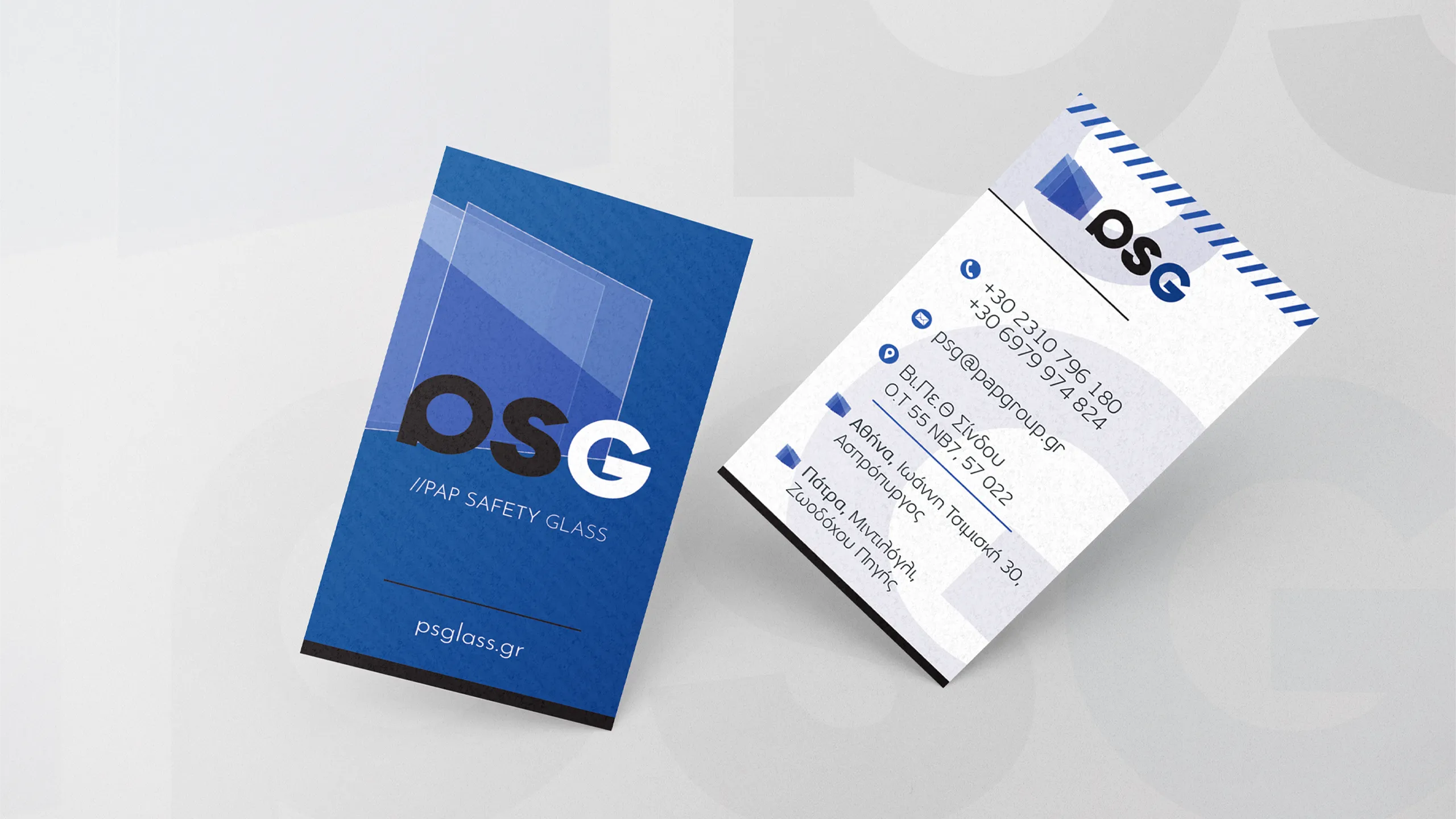
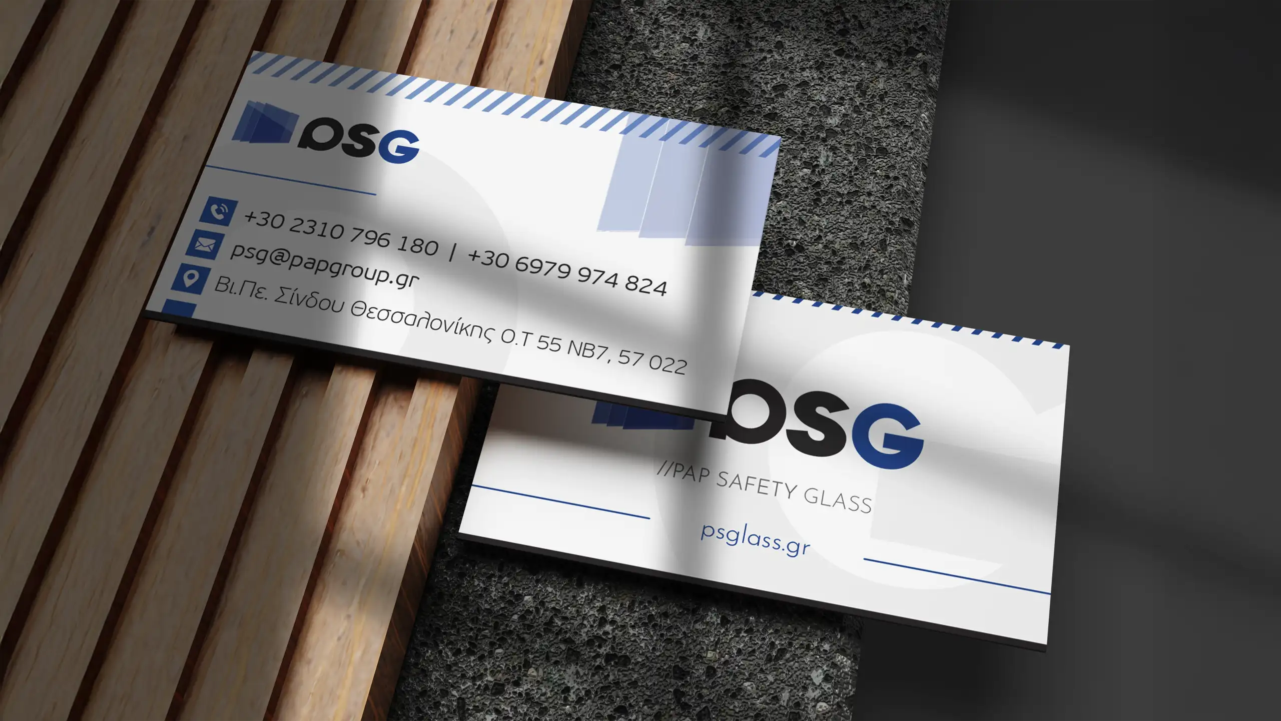
Business cards extended this direction with two distinct approaches. One featured a horizontal layout focused on simplicity and balance, while the other introduced a vertical format with a stronger use of color designed to support memorability and visual impact.
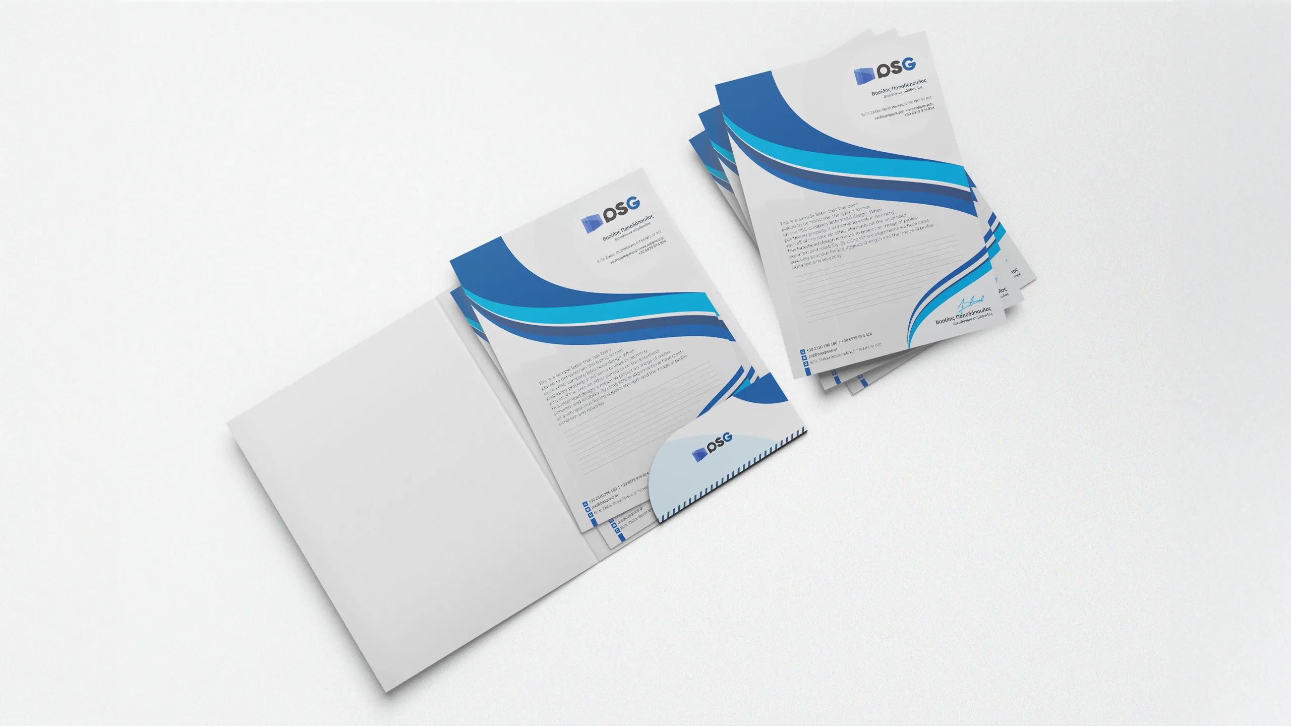
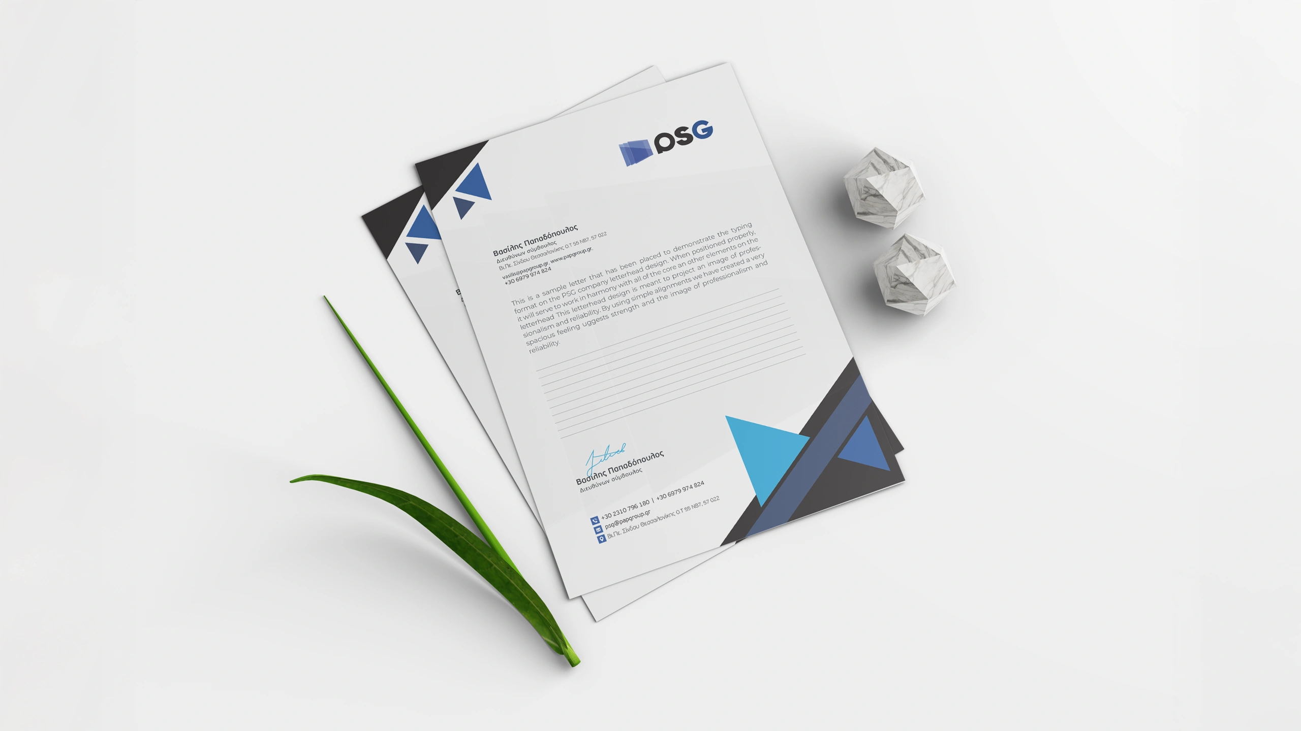
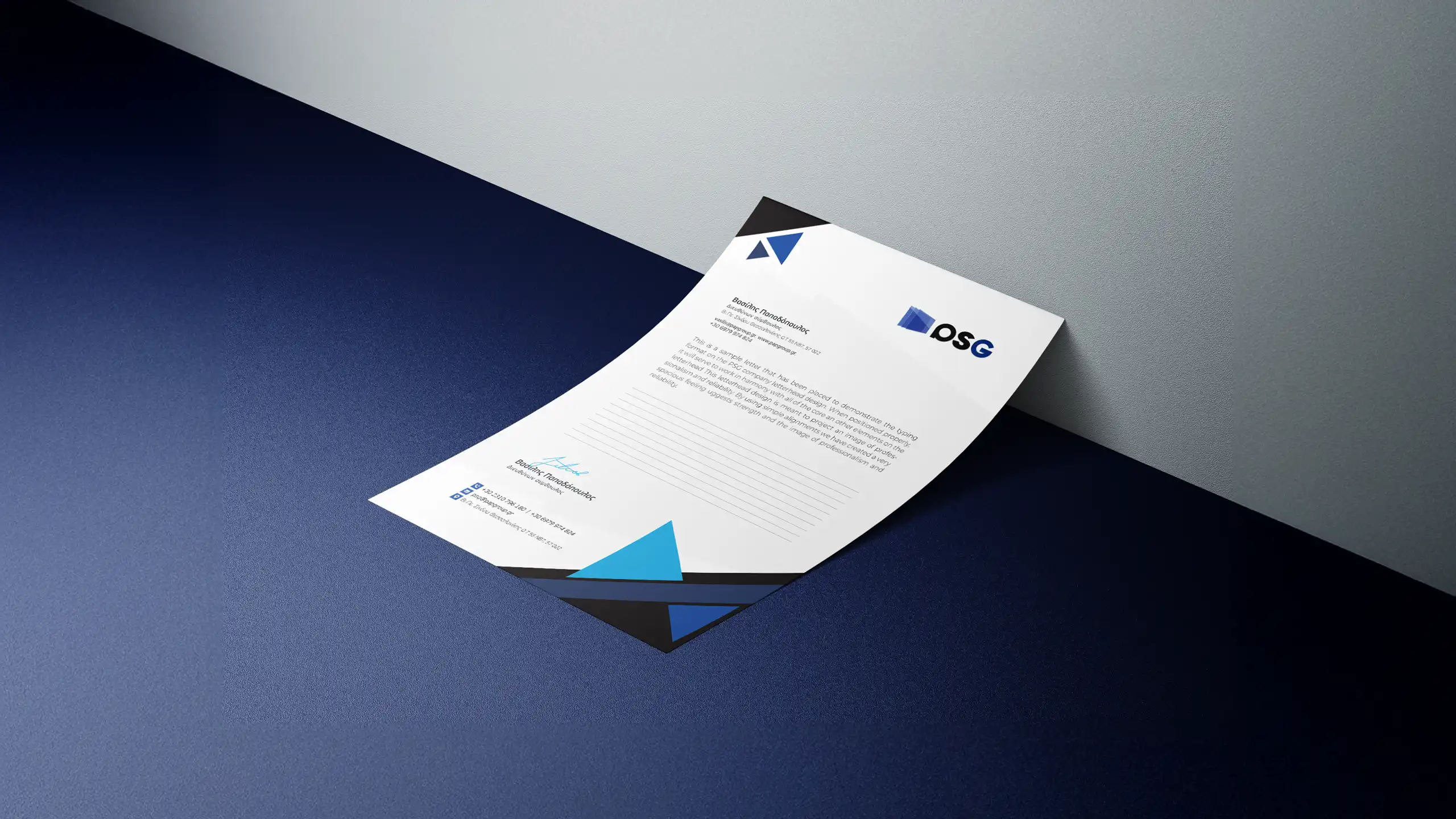
For the letterhead, two layout styles were created. The first employed curved shapes and soft gradients to convey openness and clarity. The second used sharper, angular elements to reflect structure and technical precision echoing the company’s core values.
Outcome
The final stationery system introduced a renewed sense of clarity and professionalism to the PS Glass brand. The new designs have been successfully implemented in both daily operations and formal presentations, including exhibitions. The updated print assets now reinforce the company’s identity with a unified, modern appearance.
/ Related Projects