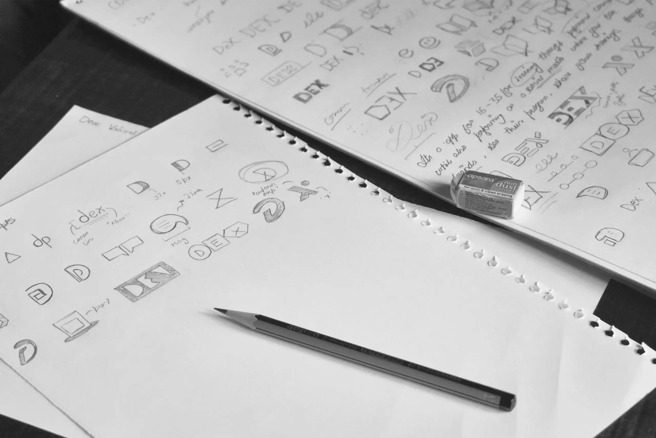
A logo should carry meaning, hold together in use, and remain clear under pressure.
Form with Function
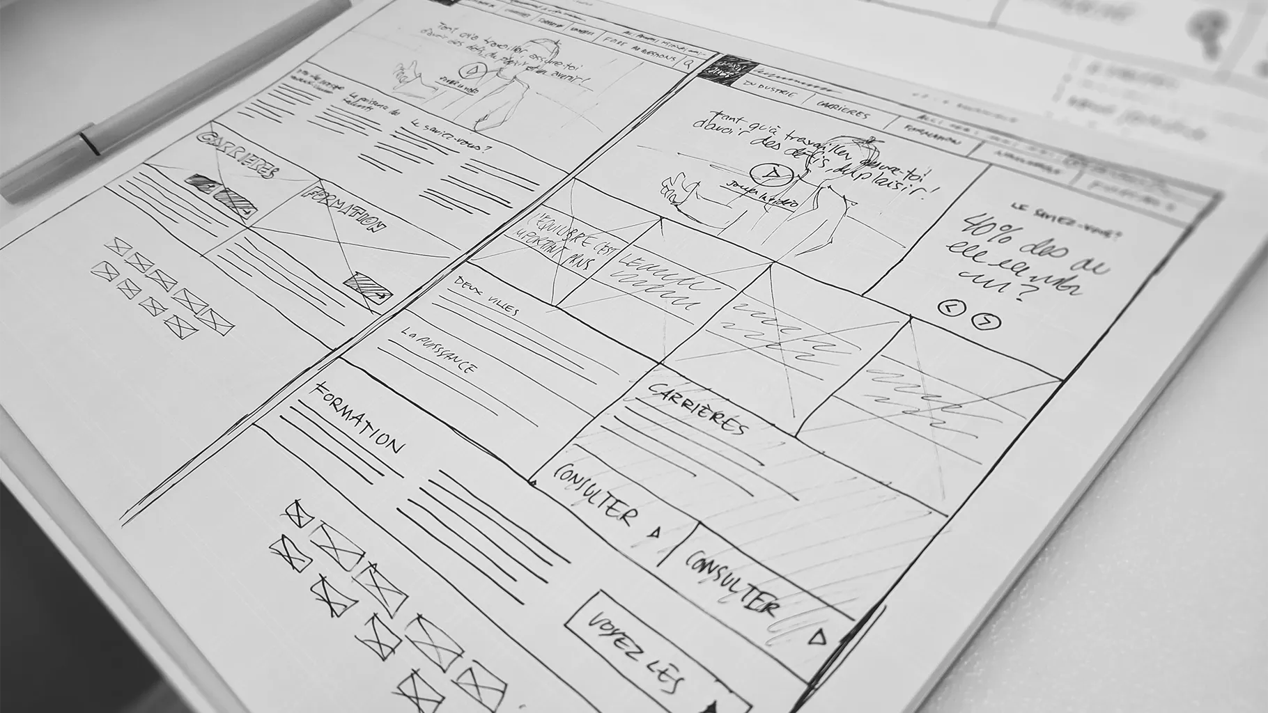
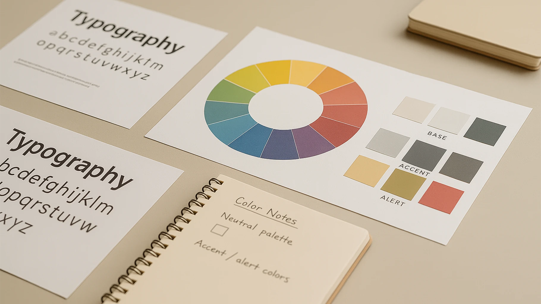
A usable logo needs more than visual appeal. It must work across different scales, surfaces, and settings. That means checking legibility, contrast, and how it performs when space is limited. Design starts to matter when it stays reliable.
Built to Adapt
A strong logo lives beyond the canvas it’s made on. It moves into print, motion, and digital. Each context reveals something new. The design must be flexible enough to respond without losing its form. A logo is not a moment, it’s a system.
Structure and Simplicity
Simplicity isn’t just a style. It helps form hold under repetition. Good logos carry structure, whether geometric or organic. That structure becomes visible when space shrinks or when time is limited, like in motion. What lasts is what holds.
Meaning Without Noise
Symbolism, lettering, or abstraction, whatever the method, clarity is what counts. A usable logo doesn’t need to explain everything. It needs to leave room for recognition. When the visual idea is clean, everything else around it finds space to follow.

