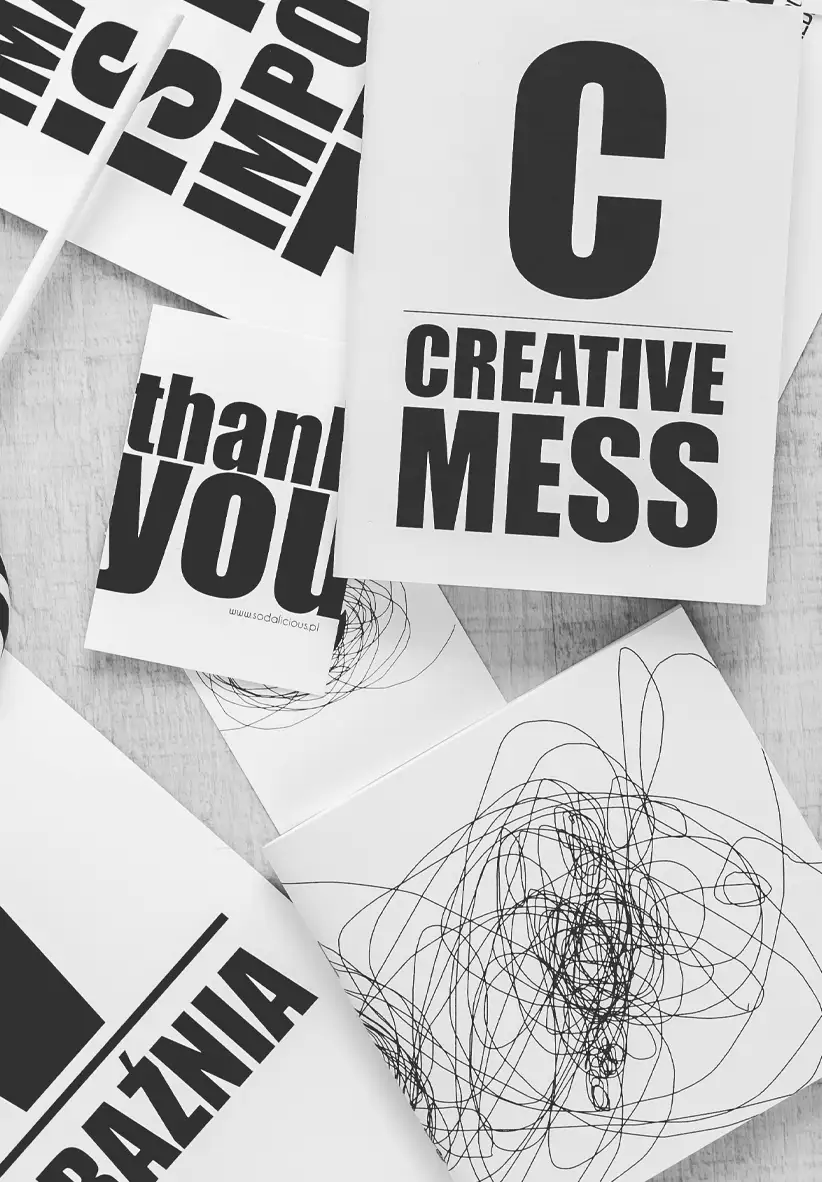
Font choice isn’t just style. It’s structure, tone, and clarity all working in quiet alignment.
Not Just Aesthetic
A good typeface doesn’t follow trends. It serves the content clearly, fits the context, and adapts well across applications. The goal is to carry the message without distraction. When a font feels invisible, it usually means it’s doing its job well.
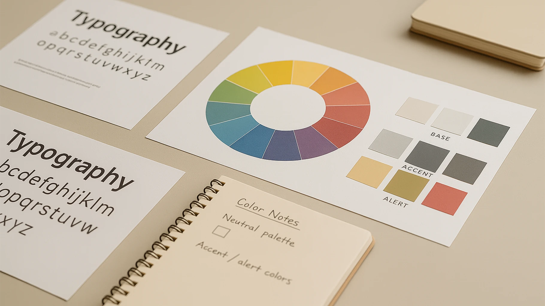
Tone and Purpose
Every font has a tone. Some feel serious, others warm or technical. That tone should match the message. In branding, especially, the wrong typeface can undo strong design. Think of type as voice. It speaks before reading even begins.
Details Matter
Size, spacing, and rhythm matter just as much as the letterform. Some fonts create space, others tighten it. Pay attention to how text leads the eye and keeps the pace steady. A solid font choice can bring clarity to the simplest layouts.
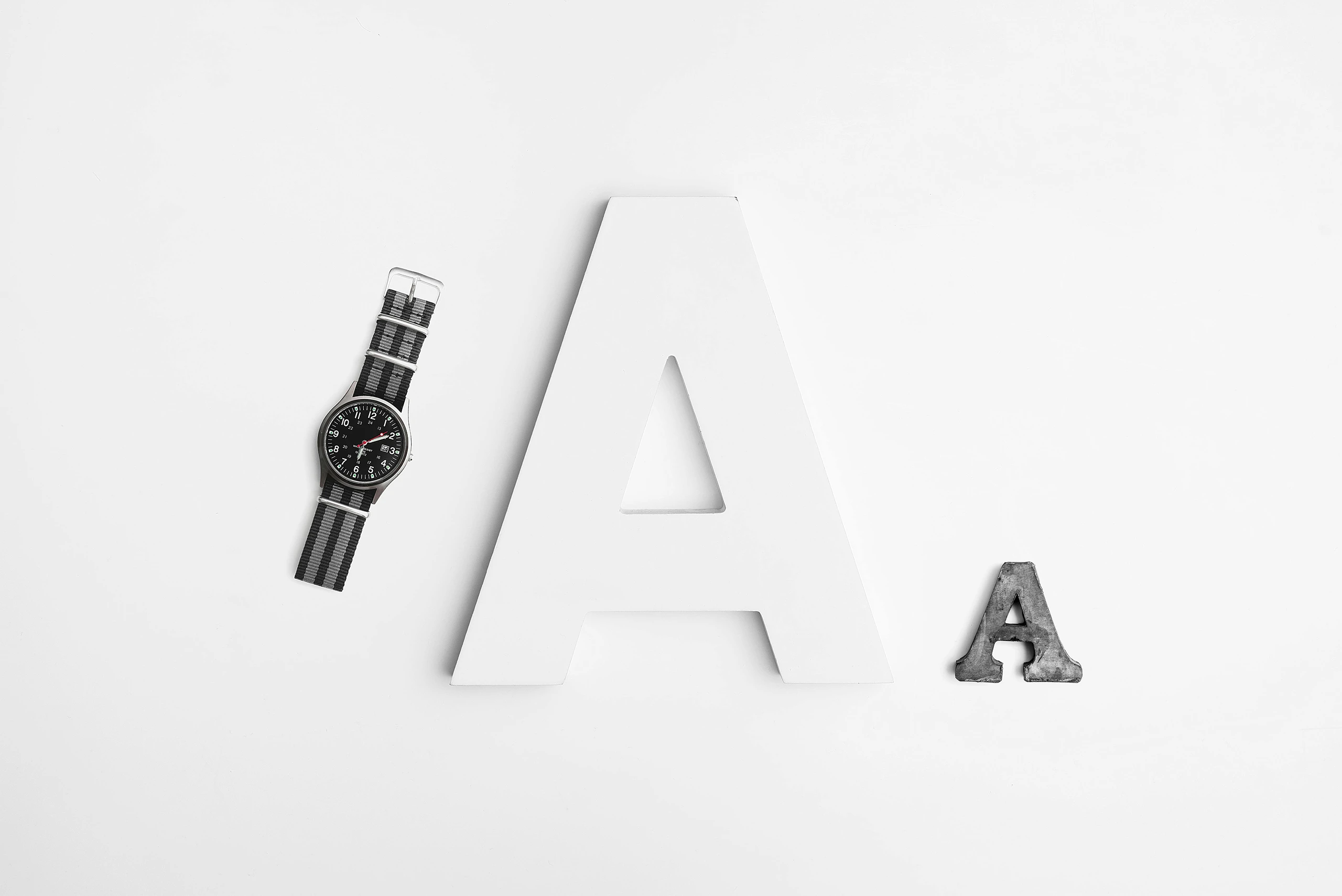
Used with Intent
More than one typeface can work, but fewer often do more. Mixing fonts should serve structure, not style for its own sake. When type is chosen with care, everything else (layout, color, motion) can follow with clarity.