Color isn’t decoration. It’s a system. When used well, it guides, supports, and balances everything around it.
Establishing a Base
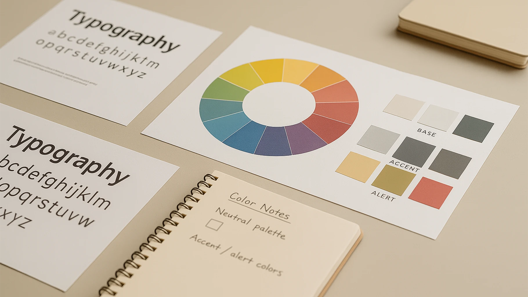
Every color system starts with a neutral. The base tones often come first because they hold everything together. They let accent colors breathe. Without a clear base, everything competes for attention.
Accent and Purpose
Accent colors bring contrast. But they need limits. The more restrained the use, the more impact each color has. Assigning meaning helps. Whether it’s direction, category, or hierarchy, a color should never just look nice.
Accessibility and Clarity
Color must be usable. That means checking contrast, understanding how combinations read, and making sure nothing relies solely on hue. Accessibility strengthens design. It doesn’t limit it.
Application and Balance
Colors behave differently depending on where they appear. A strong tone might feel sharp on white but softer against dark. The same color can change mood depending on its surroundings. That’s why testing in live layouts is better than relying on isolated swatches.