

Summary
An organic brand identity for Neuroland, a therapy and rehabilitation centre, combining specialist expertise with a welcoming character.
Client
Agency
Scope
Visual Identity · Logo Design · Color System
Location
Katerini, Greece
Year
2026
The Challenge
Neuroland needed to communicate specialist expertise to adults, children and their families while making the centre feel approachable.
The brief called for a calm, mature identity with enough flexibility to represent different disciplines as the practice develops.
The Brand
Founded by Vefa Triantafilopoulou, an occupational therapist specialising in neurological rehabilitation, Neuroland places everyday participation at the centre of its approach.
The founder’s vision extends beyond the treatment room, connecting therapeutic support with familiar activities and environments, including the sea.
Design Approach
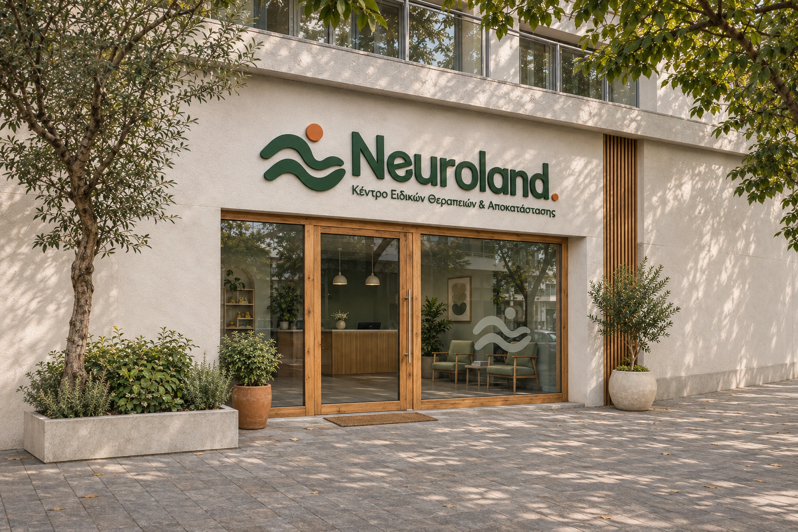
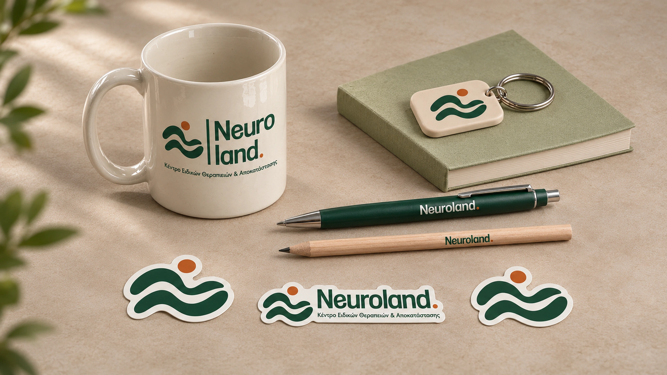
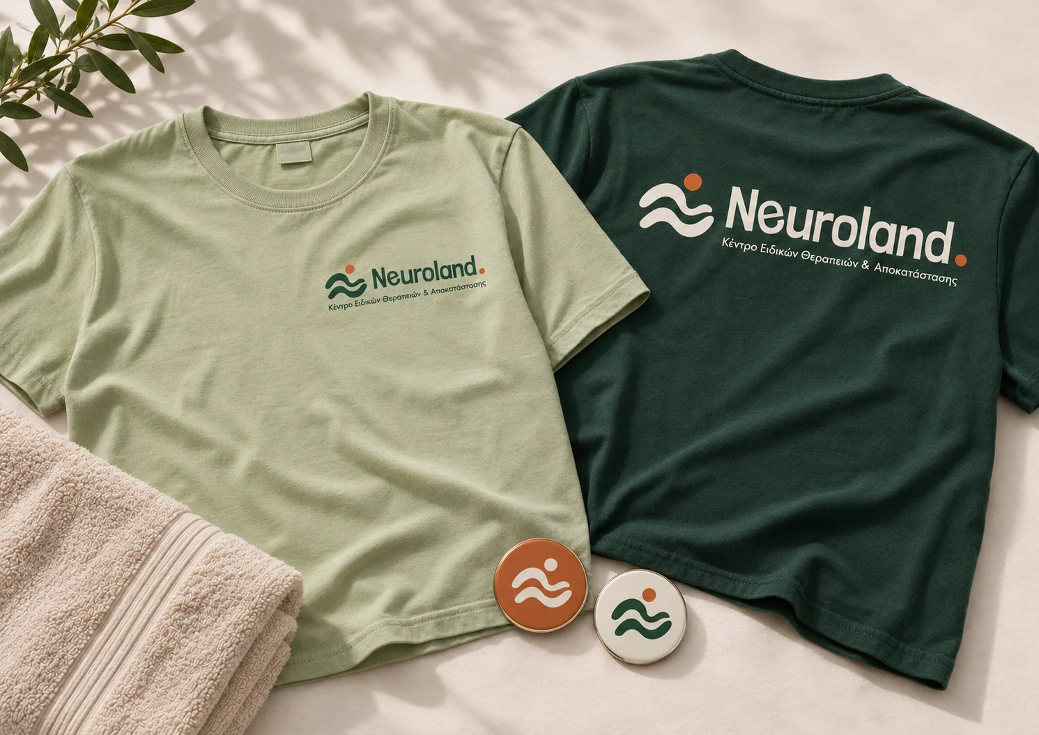
The logo combines an abstract human figure with two flowing forms. A circular head gives the upper curve a human presence, while the lower form creates a sense of support. Facing to the right, the figure appears to take a step forward, suggesting progress and a positive outlook. The flowing curves connect this gesture with the rhythm of a wave, carrying a sense of movement throughout the symbol. The reference to the sea is rooted in a specific idea from the brief: helping people return to environments and activities that matter to them.
The negative space between the two flowing forms subtly suggests a lowercase n, revealing a secondary connection to the Neuroland name.
Rounded contours and substantial lettering give the wordmark an organic, assured presence. Within it, the e takes a slightly different angle from the surrounding letters while retaining the same visual weight. This deliberate variation introduces an understated idea of inclusion: a different form can hold an equally strong place within a shared whole.
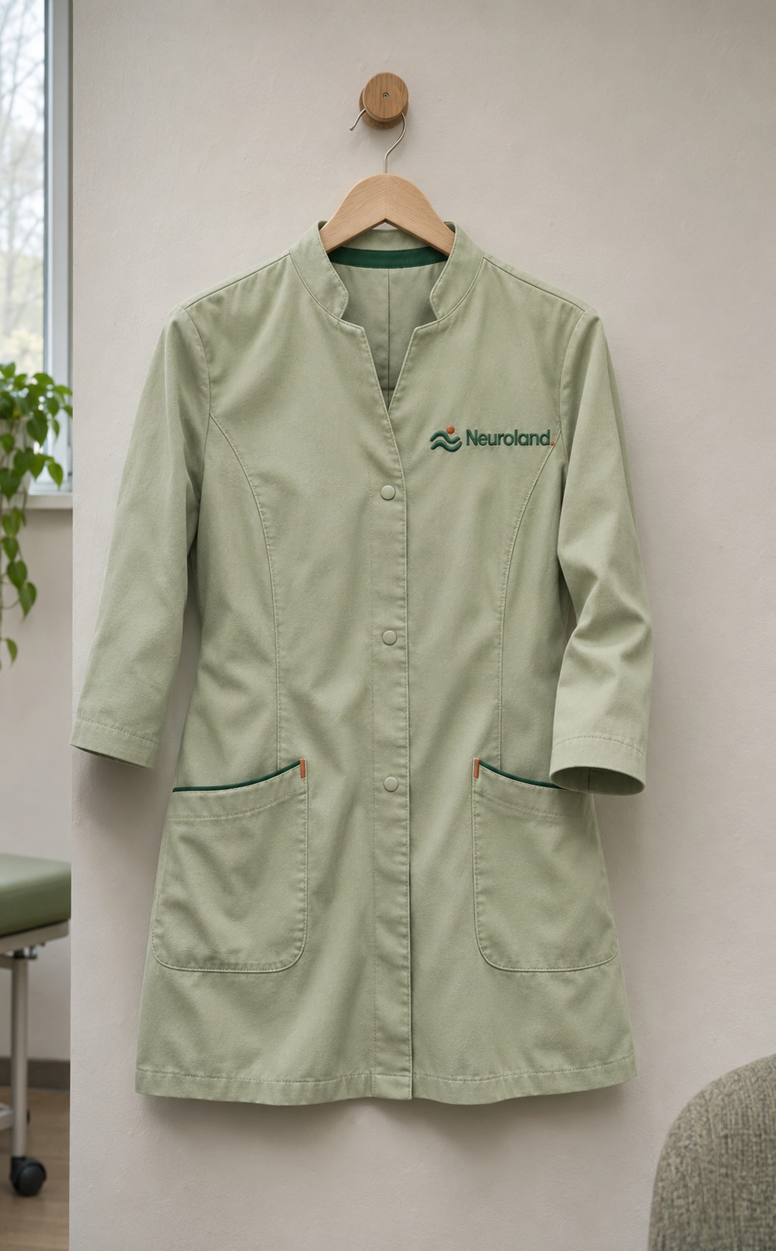
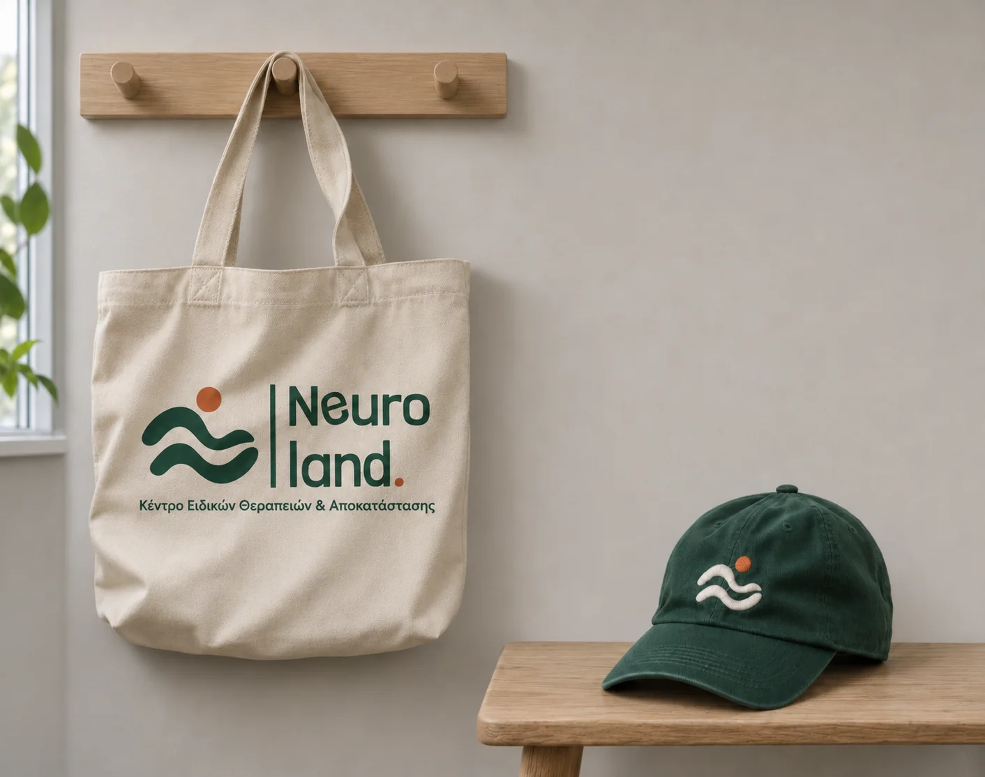
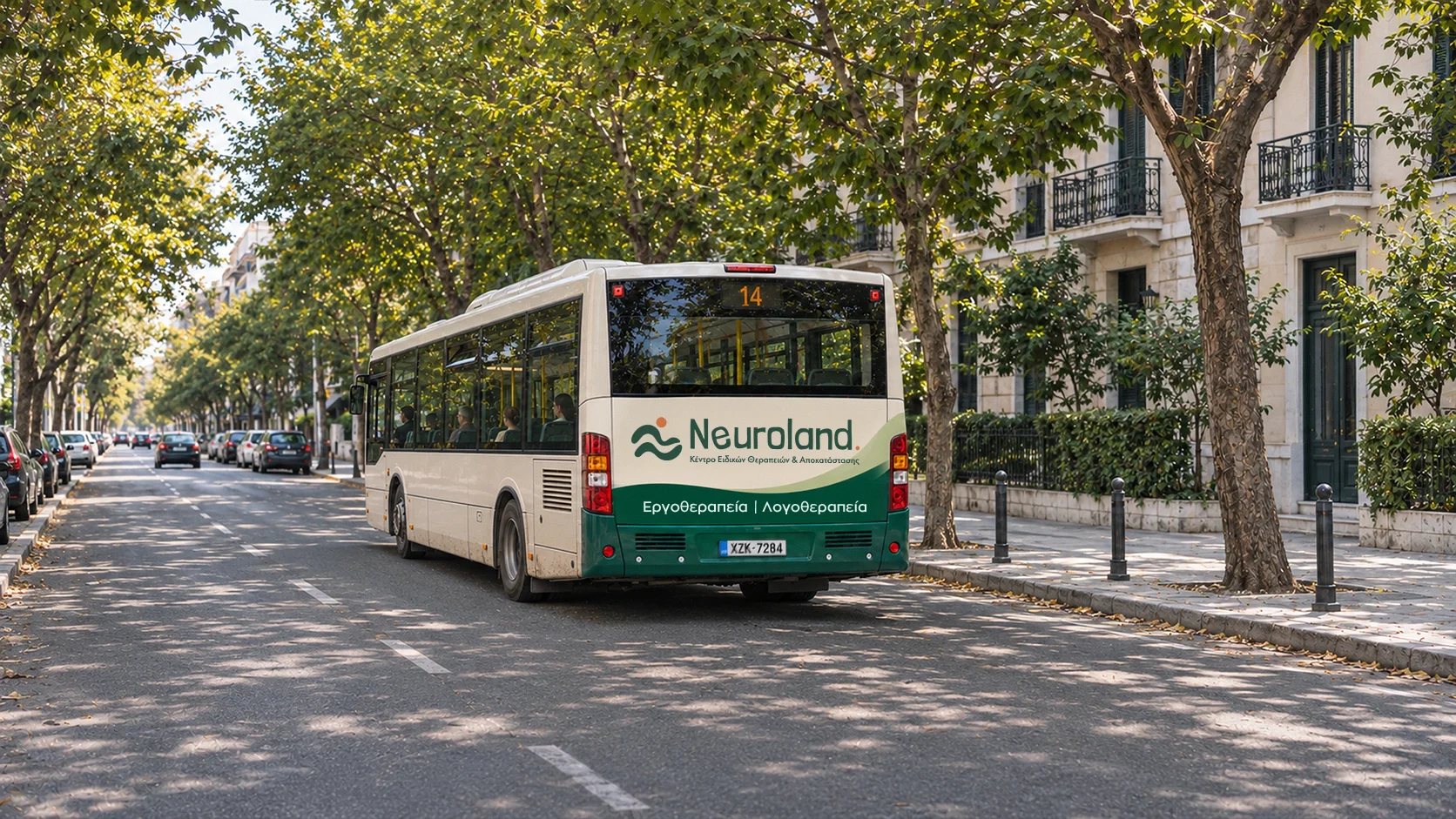
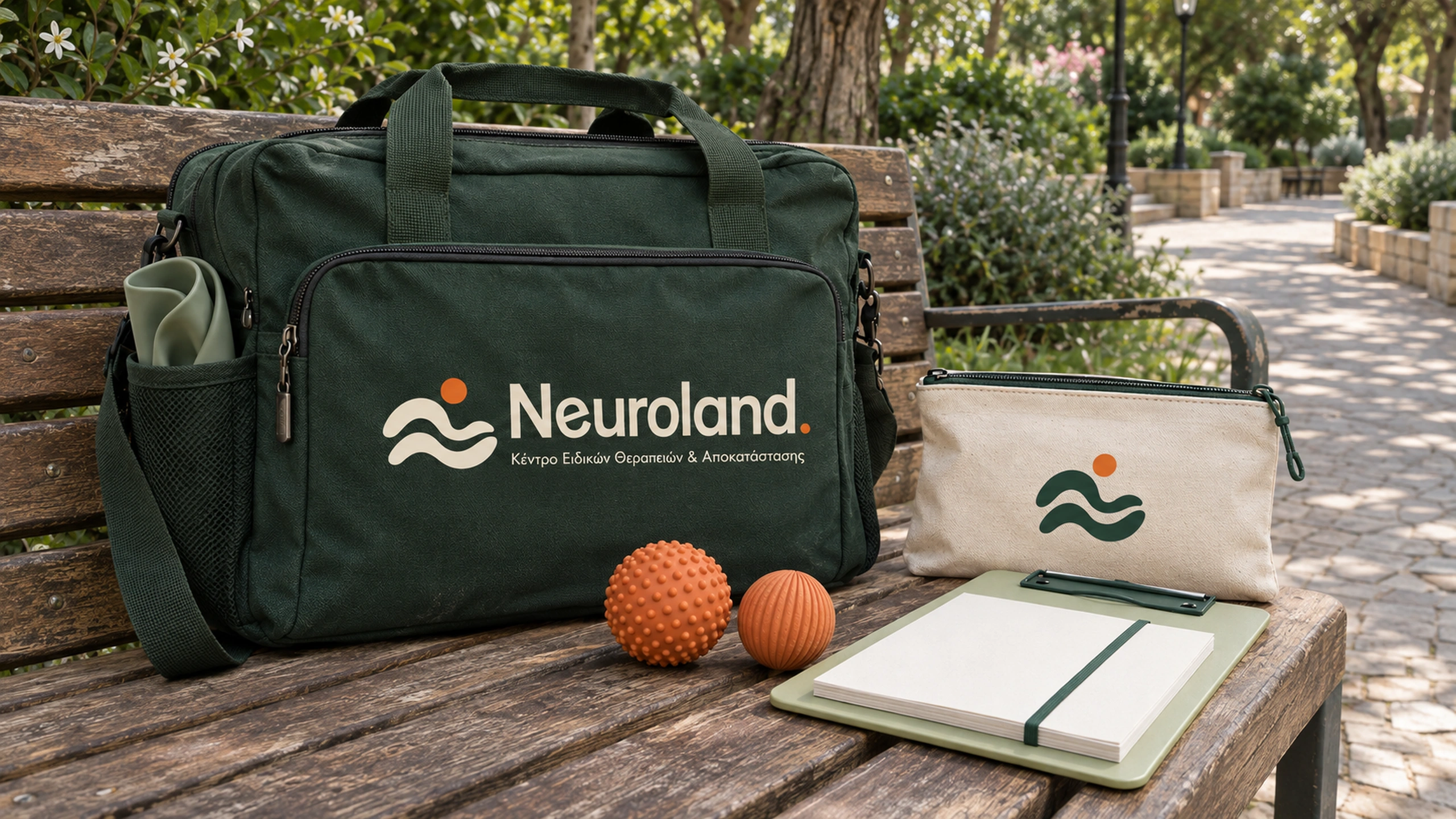
Horizontal and stacked compositions accommodate different formats. Selected curves extend into supporting graphics, creating continuity across stationery and proposed brand applications.
Color System
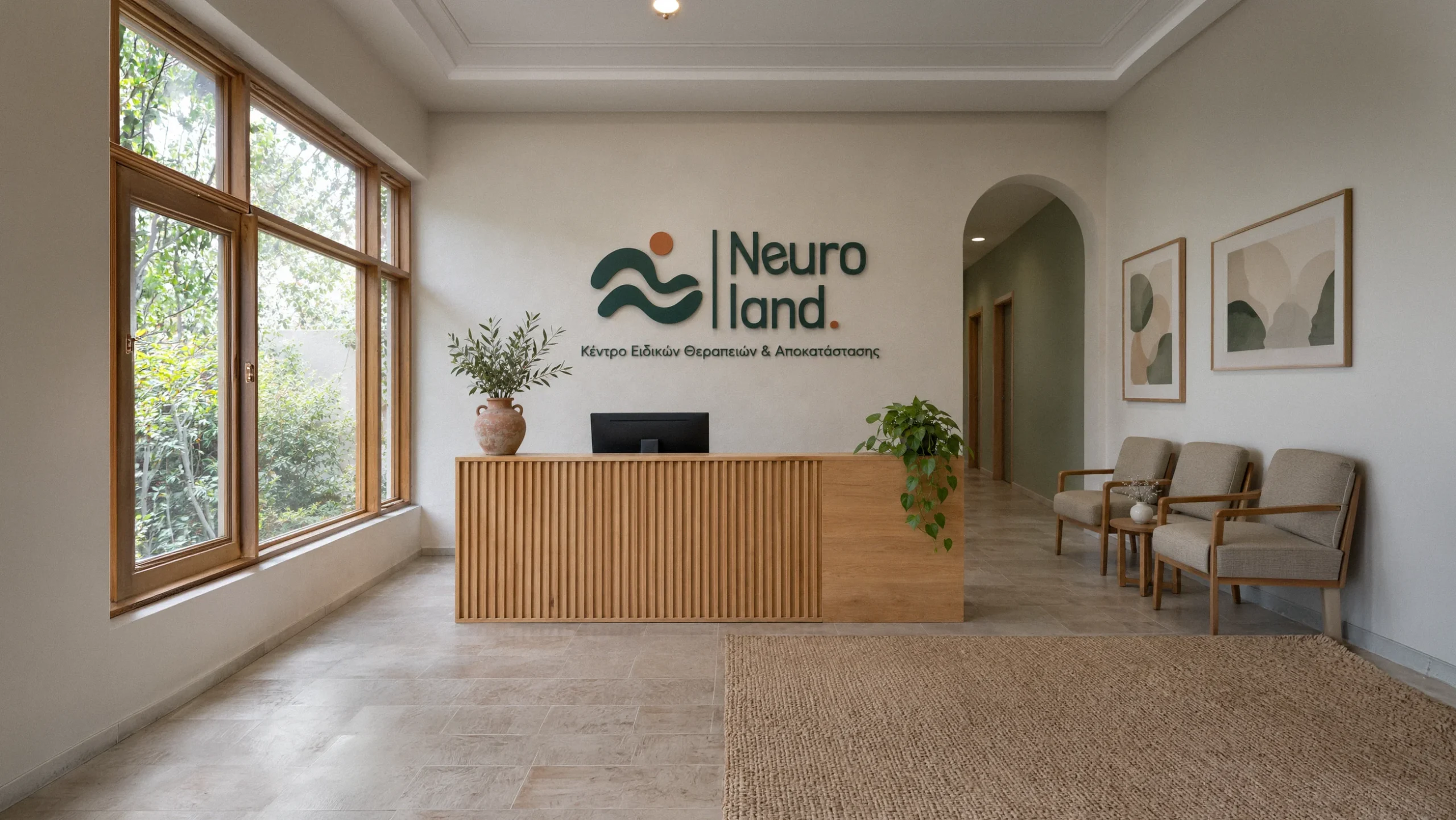
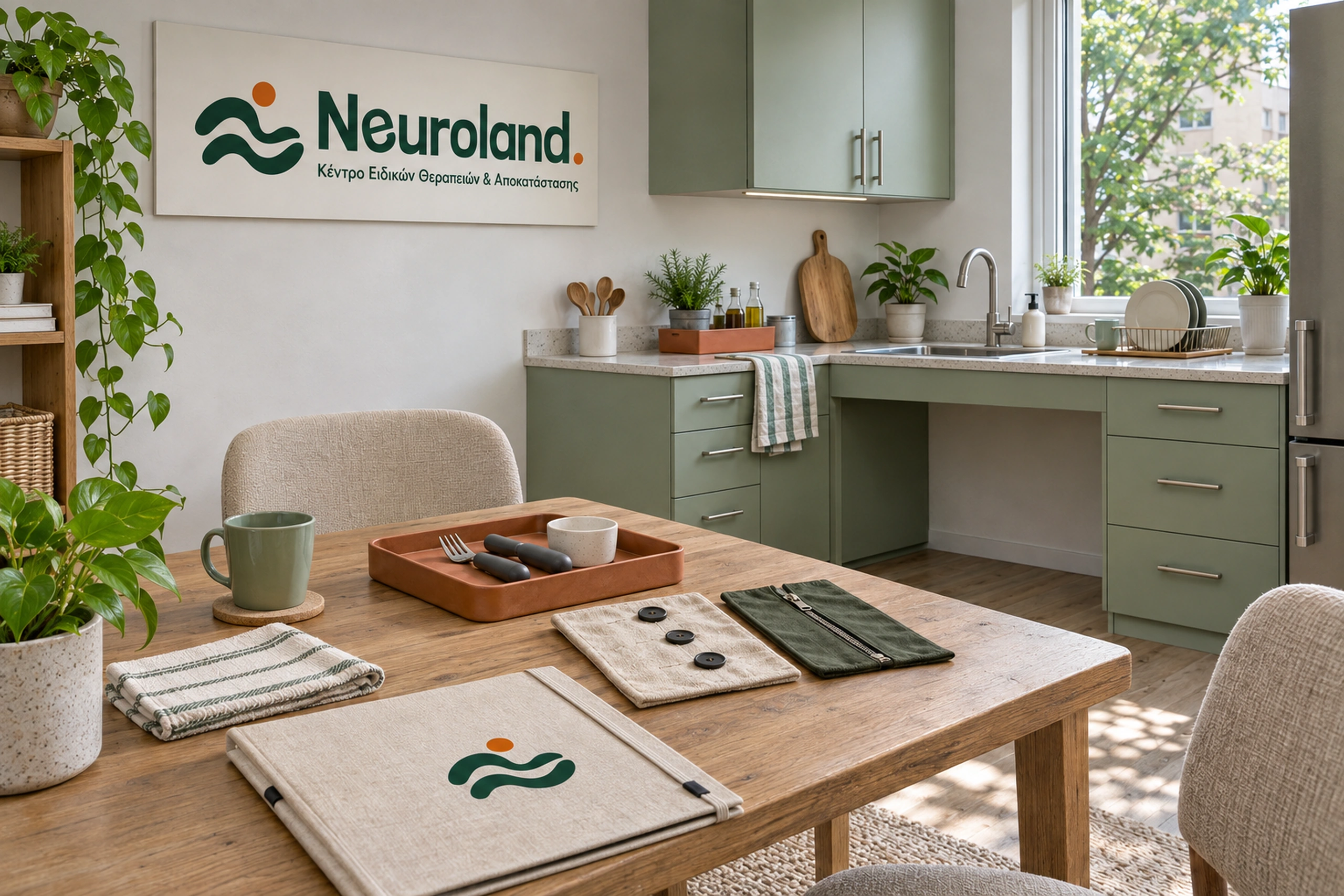
The palette combines muted green, deep green, warm beige, warm white, and orange, connecting the identity with the centre’s welcoming interior:
- Muted green gives the identity a calm, approachable character and creates continuity with the physical space.
- Deep green provides contrast and definition across the logo, typography, and supporting graphics.
- Warm beige adds warmth and a natural quality to printed materials and backgrounds.
- Warm white keeps compositions light and gives text and graphics room to breathe.
- Orange highlights the human figure and introduces a personal reference to the founder’s distinctive hair colour.
Together, these colours create a quiet, cohesive identity with a recognisable point of emphasis.
Outcome
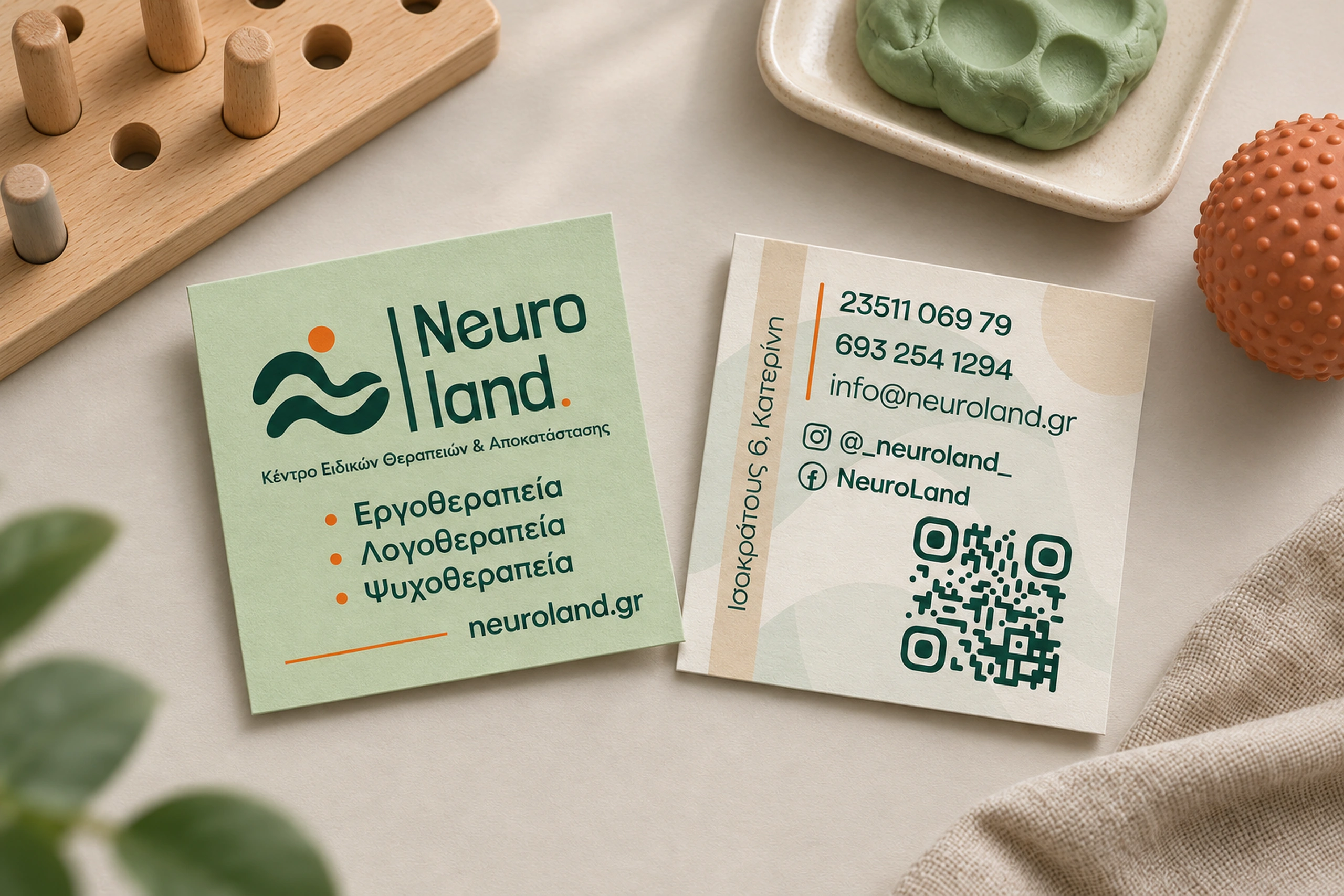
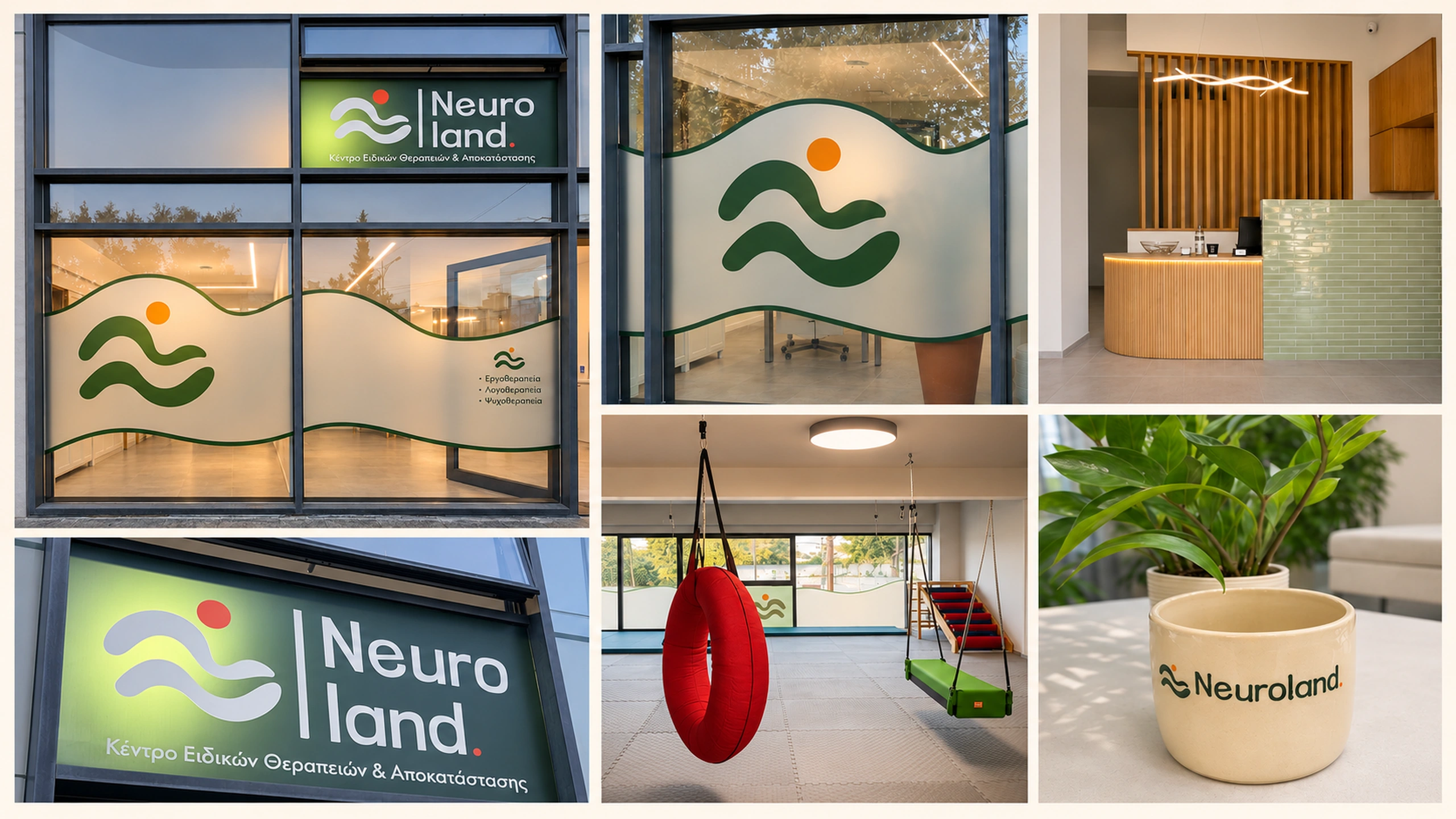
The identity has been implemented in the centre’s exterior sign and window graphics. The flowing contours continue across the frosted glazing, extending the visual language beyond the logo. Final business card artwork brings the same colours and forms into everyday communication. Together, these applications establish a consistent foundation for Neuroland’s presence.
/ Related Projects