Summary
A bold brand identity for a marble company built on heritage and strength.
The Challenge
The objective was to develop a brand identity that reflects the company’s strong foundation and enduring connection to the Greek marble trade while positioning it as a modern and trustworthy business ready for international engagement. The design needed to express weight, stability, and elegance without relying on outdated or literal symbolism.
The Brand
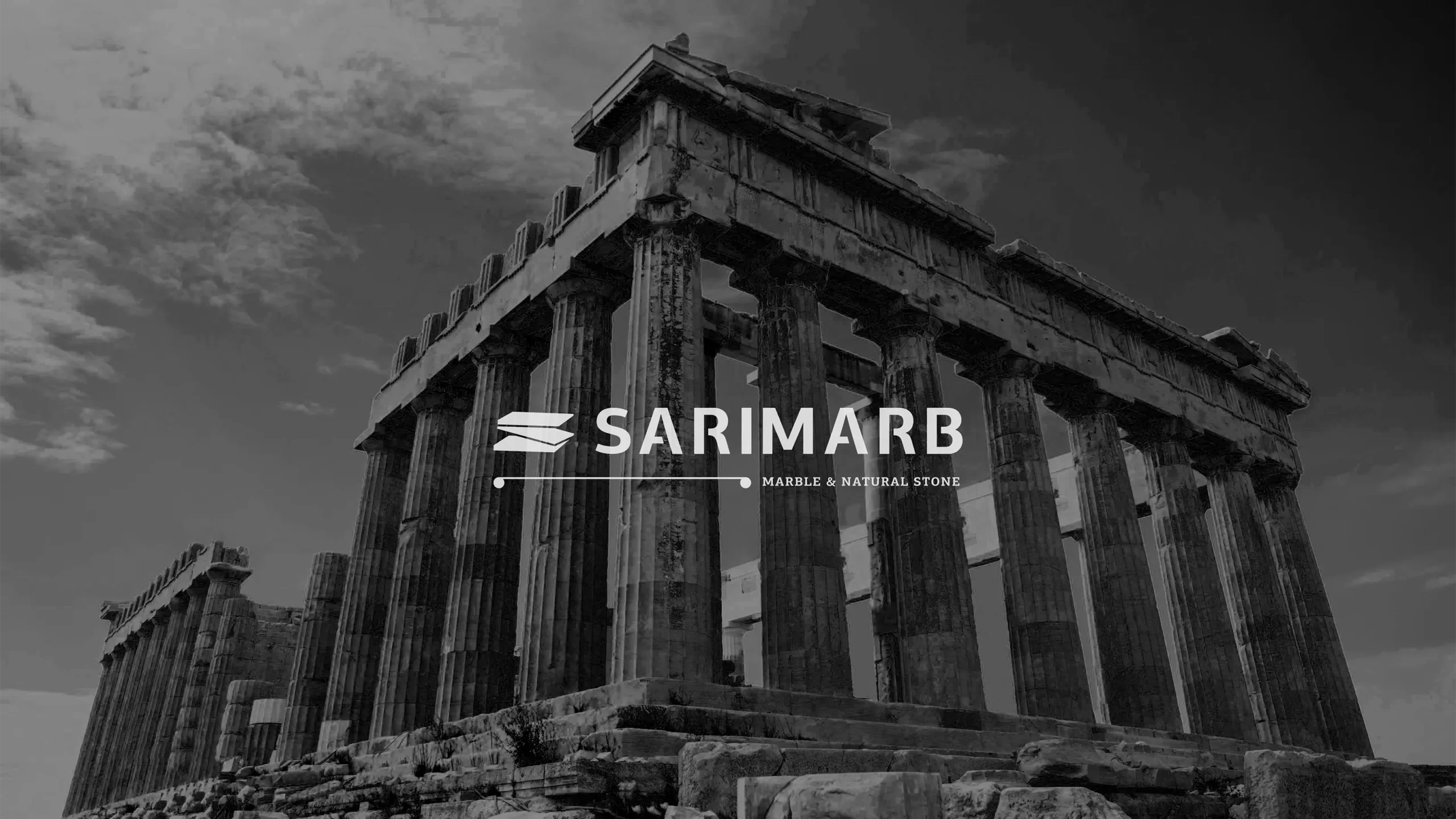
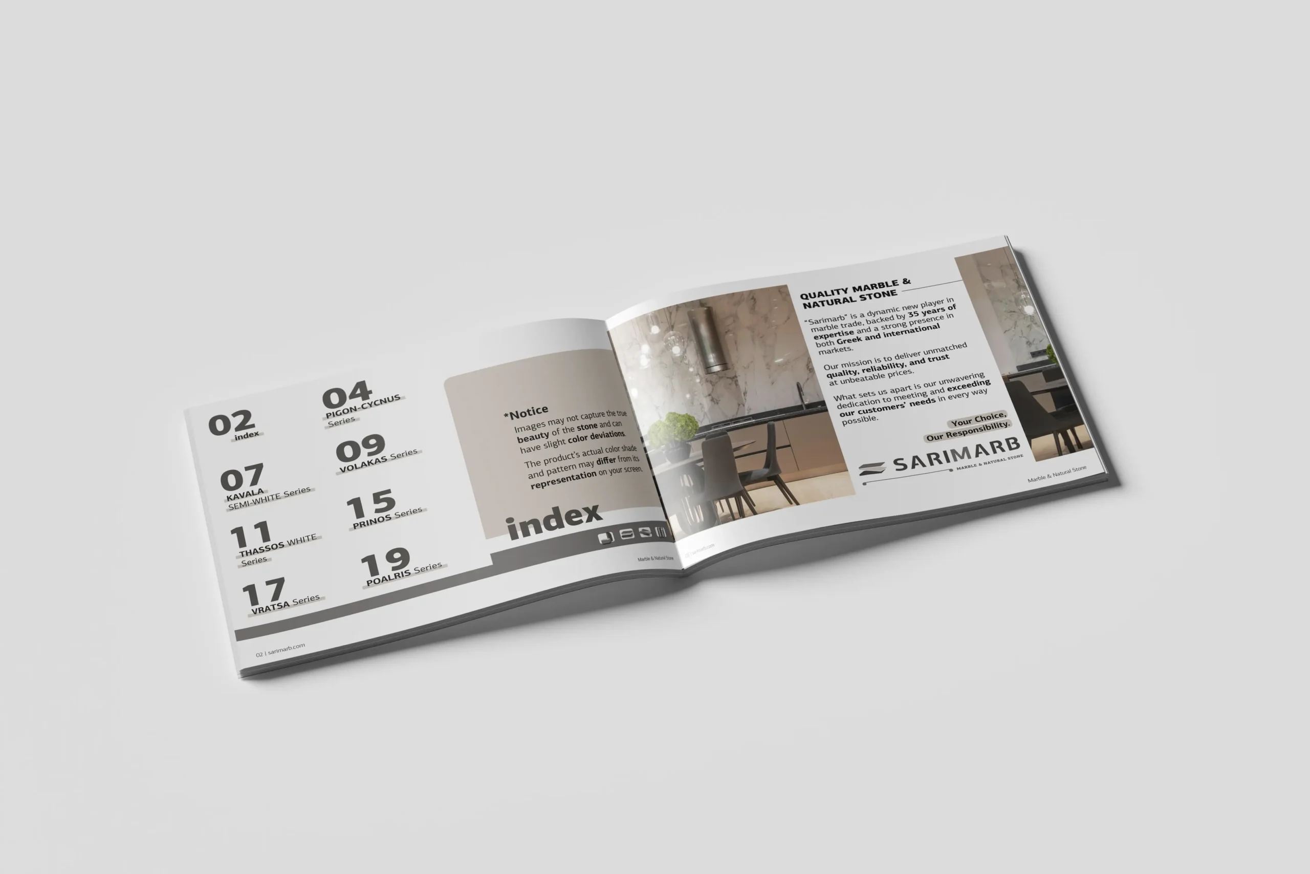
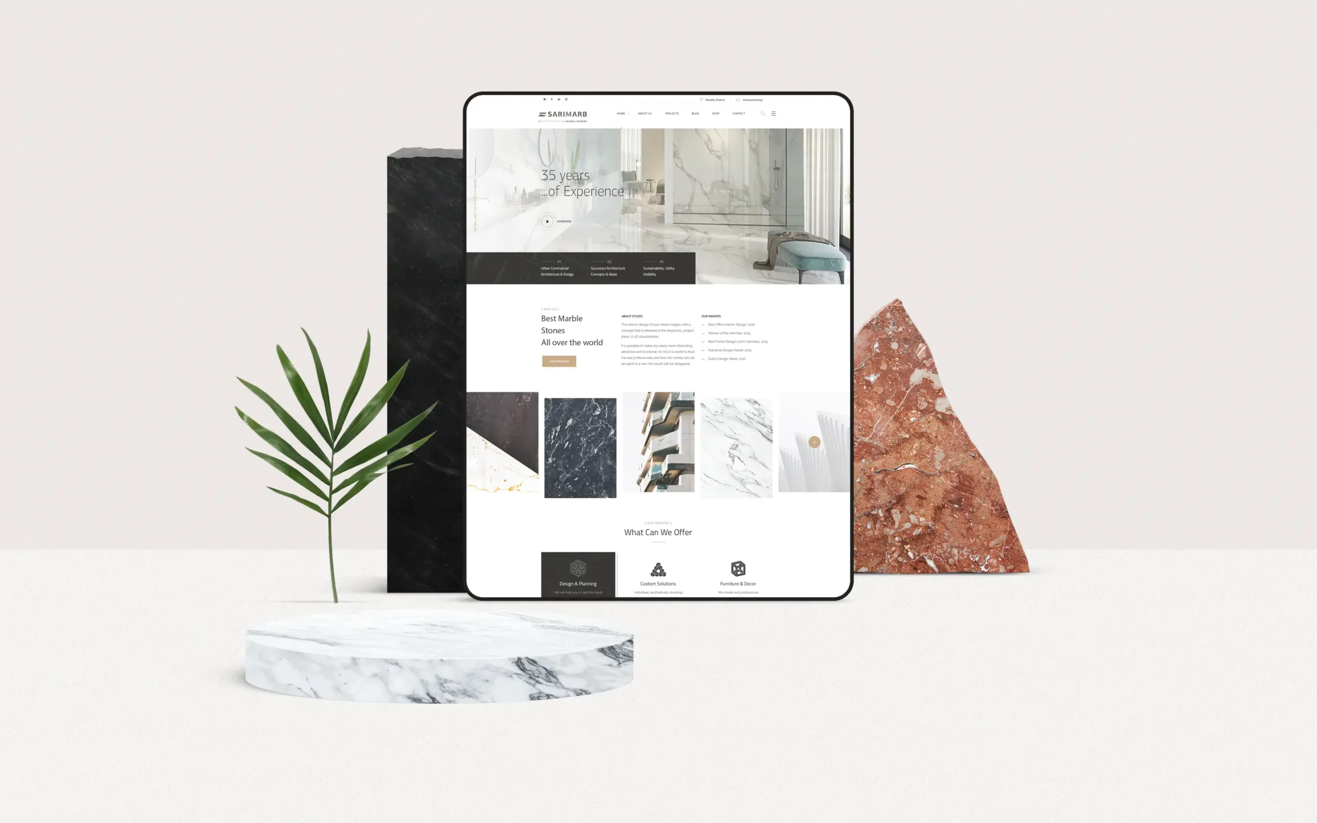
SARIMARB is a marble trading company based in Greece, with over three decades of industry knowledge. Although recently established, it is backed by 35 years of experience in natural stone selection, processing, and export. The company operates across the Greek and international market, driven by values of precision, reliability, and service-focused business culture.
Design Approach
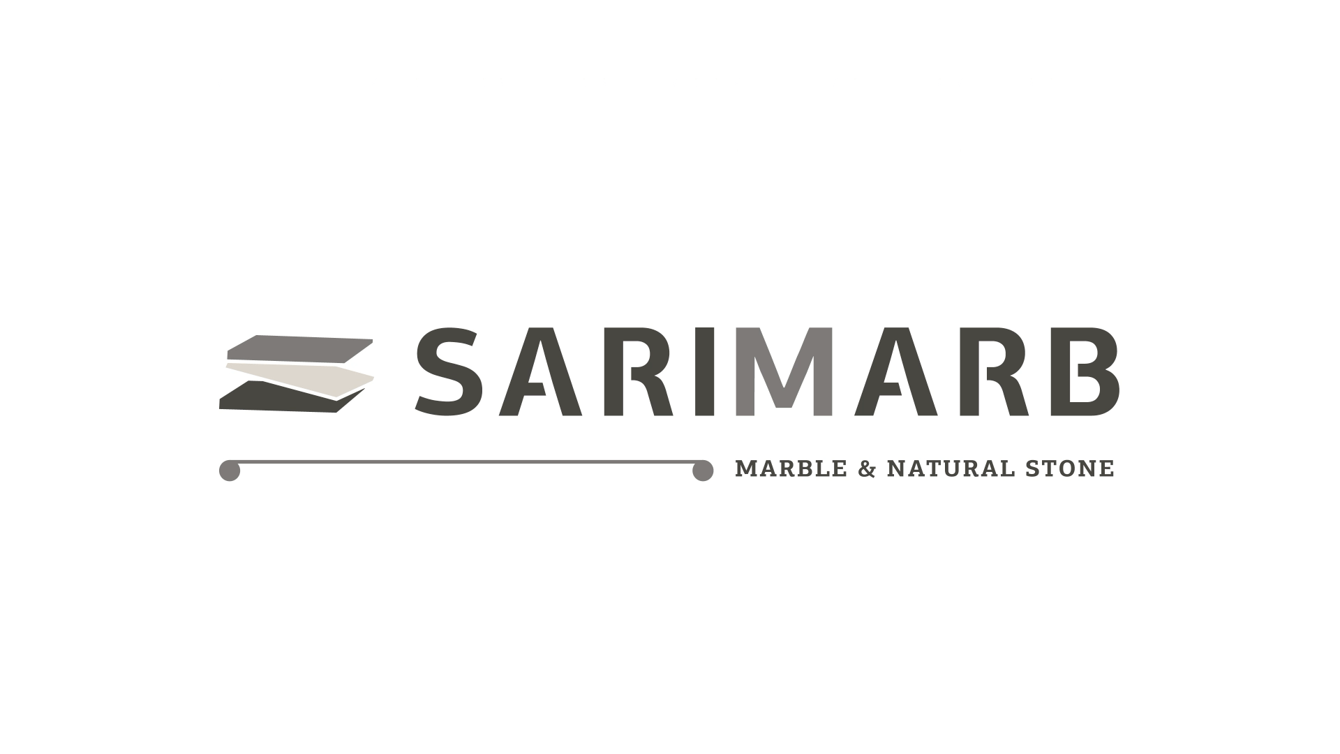
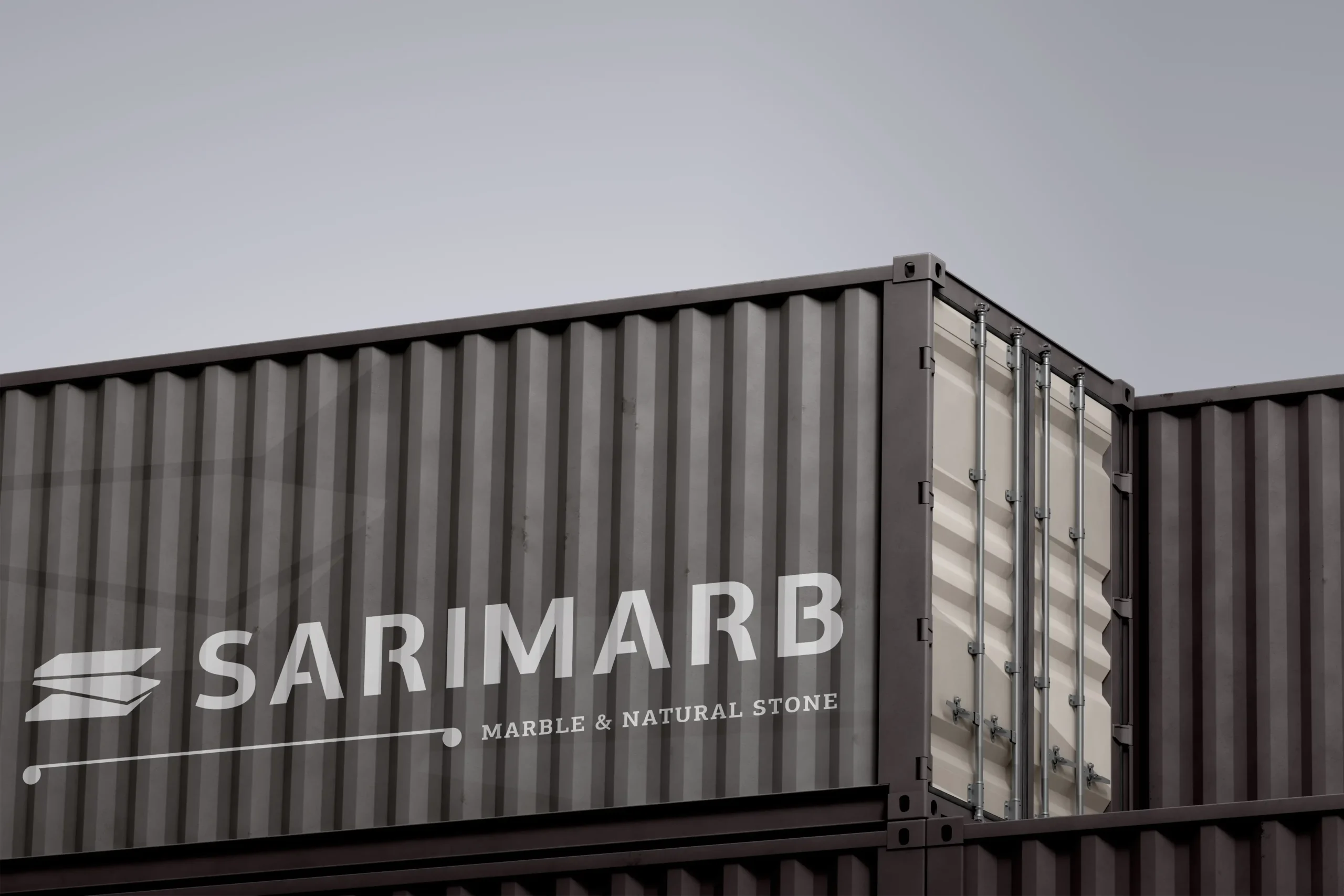
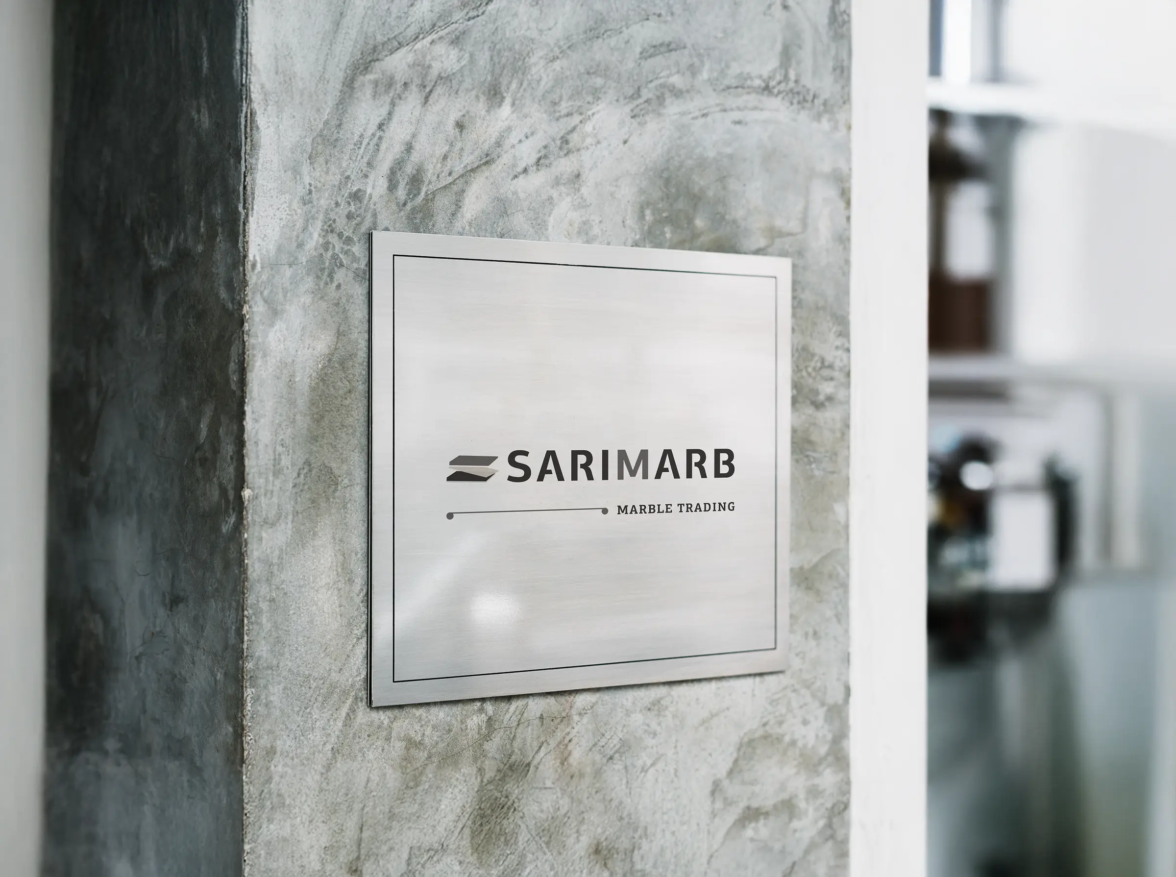
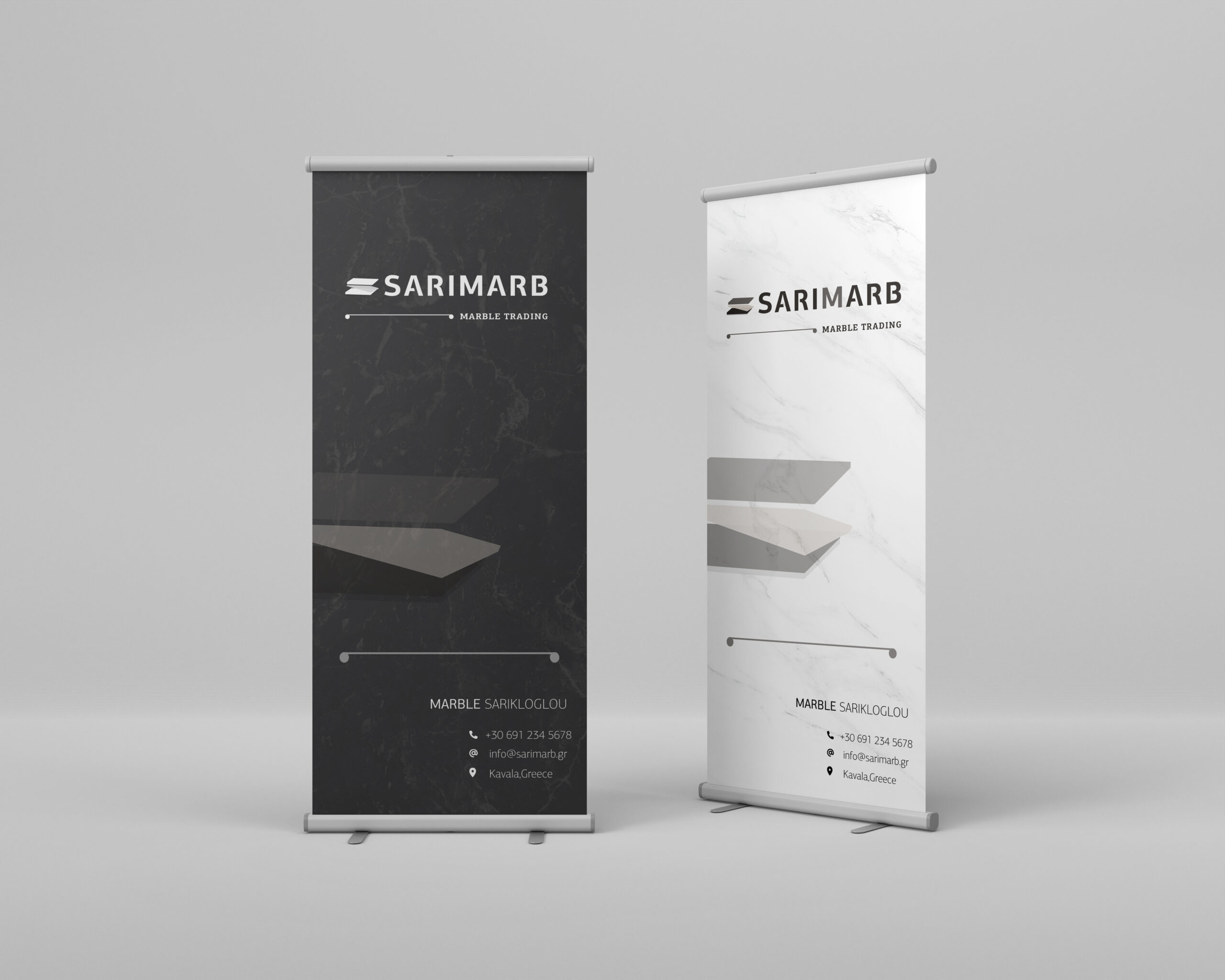
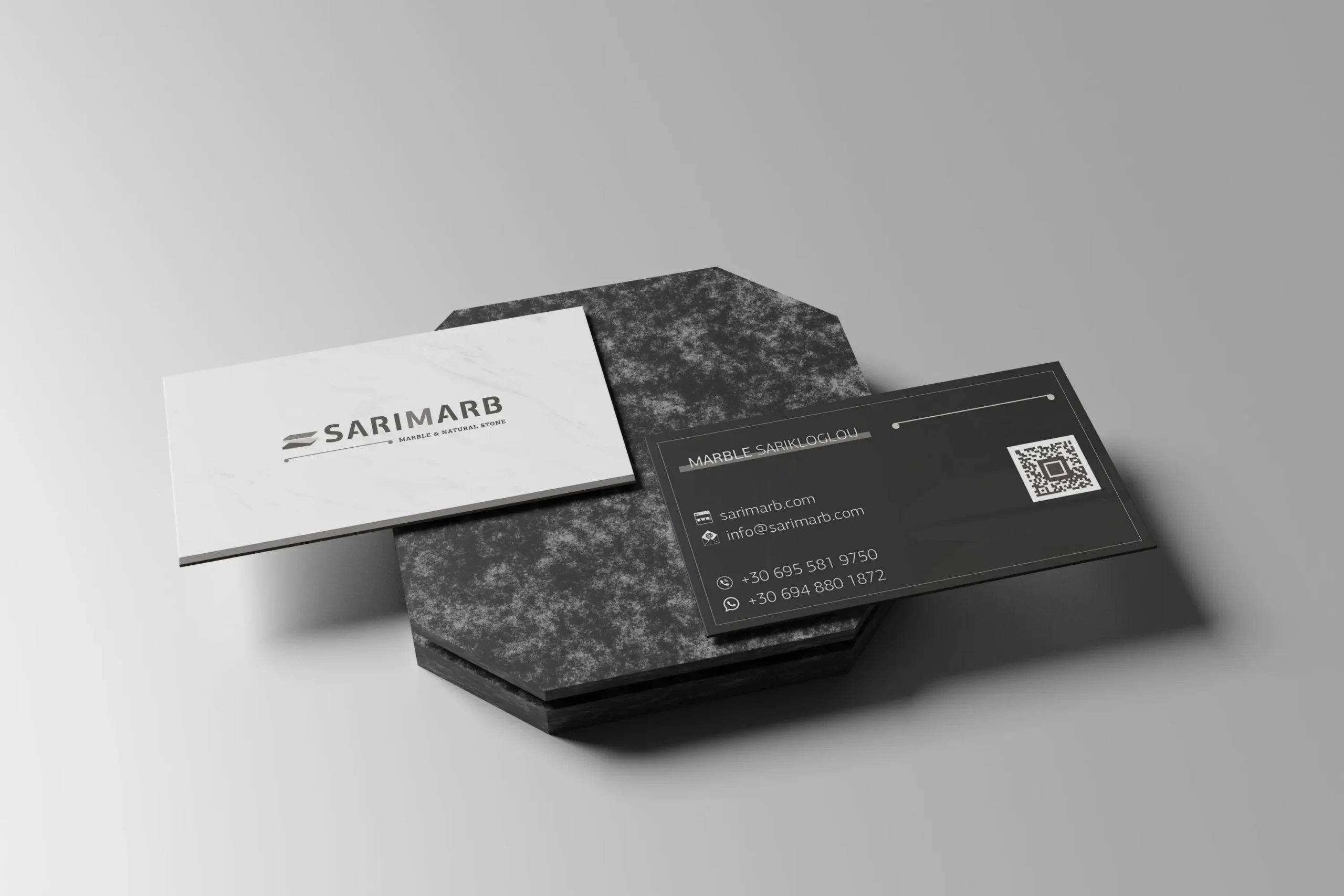
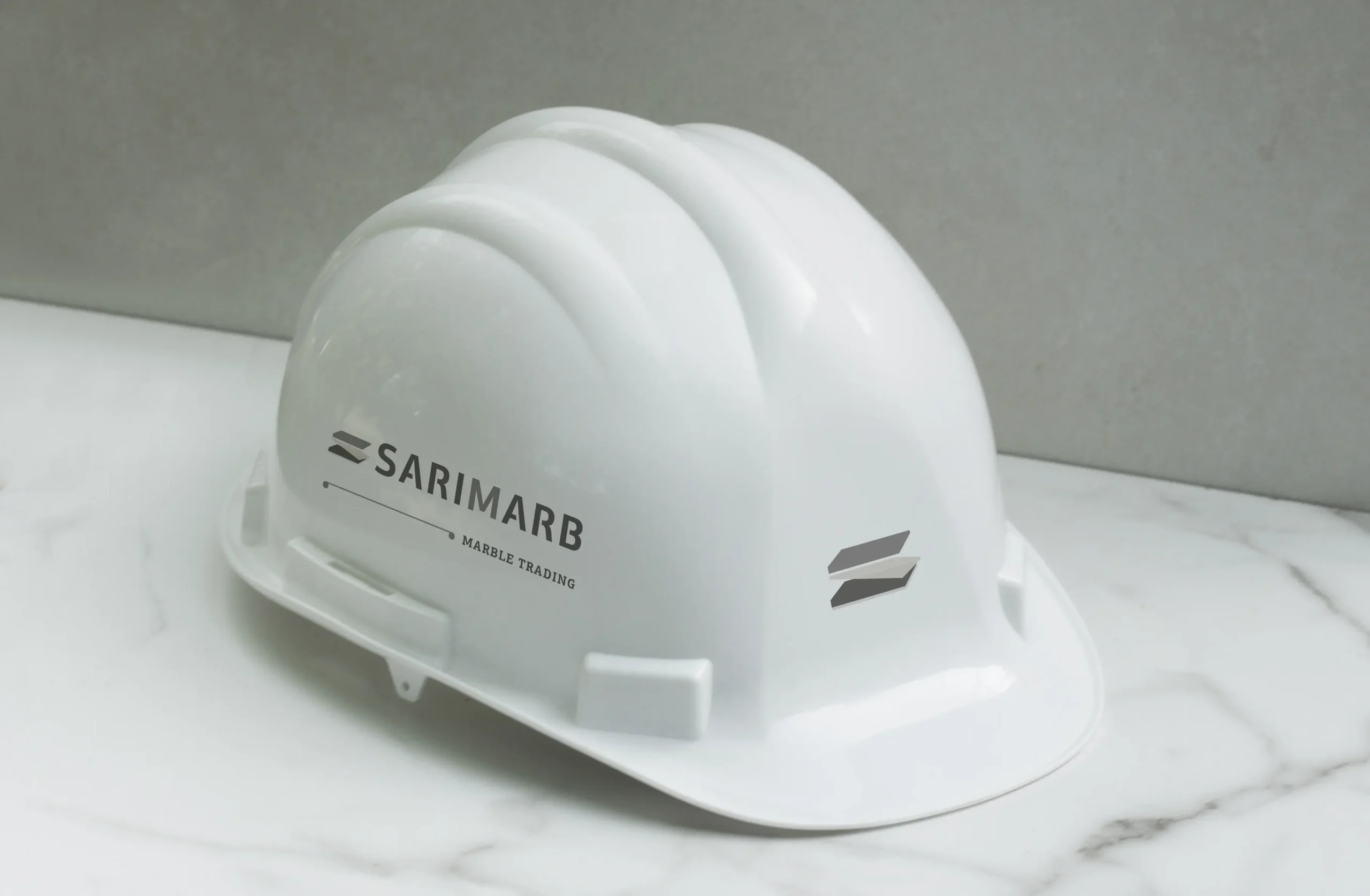
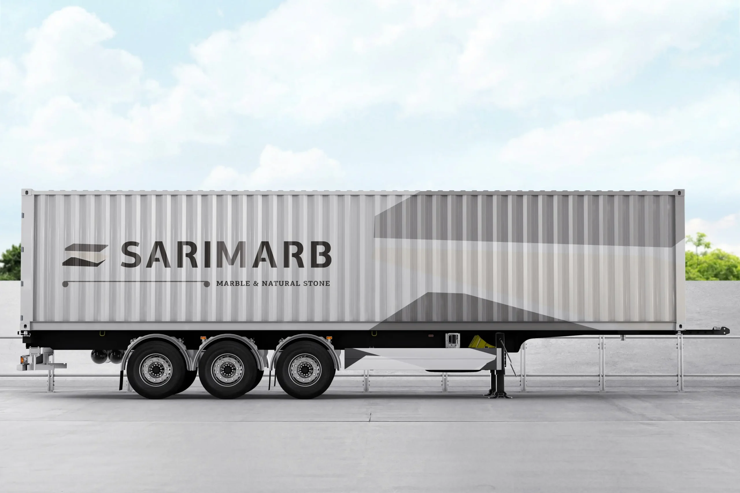
The visual identity is built around a central emblem that combines classical symbolism with contemporary structure. Inspired by the architectural form of a column capital, the mark incorporates three geometric stone slabs arranged to subtly form the letter “S” a reference to the family name behind SARIMARB.
The center slab leans forward, suggesting movement, direction, and the physical process of transporting marble. The overall structure conveys strength, depth, and craftsmanship. The 3D illusion and visual weight of the emblem were carefully designed to evoke the company’s values: stability, trust, and material excellence.
Typography choices support this dual character. The logotype uses a heavy sans-serif with geometric cuts that enhance clarity and individuality, while the tagline is set in a slab-serif, referencing classical print and stone carving traditions.
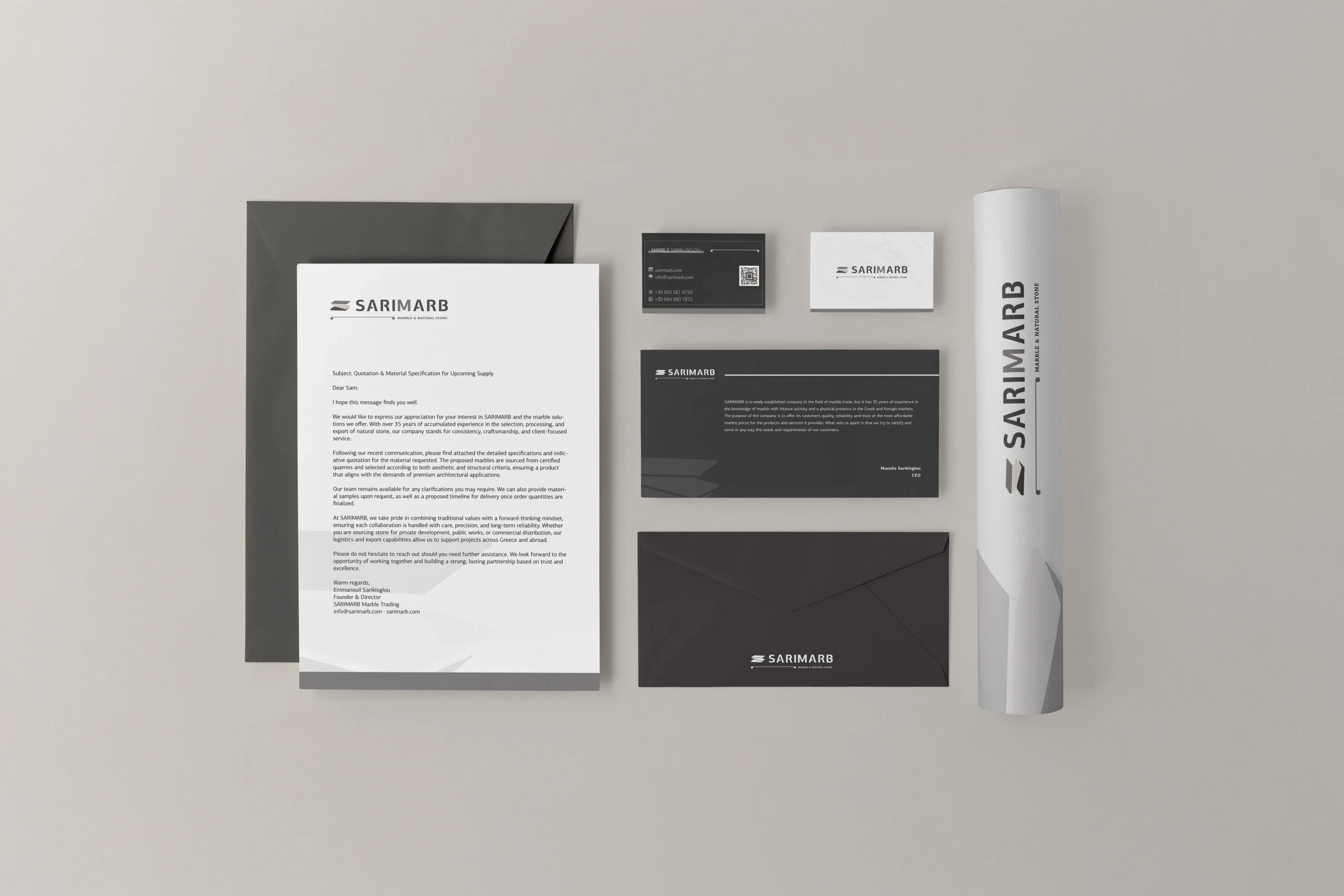
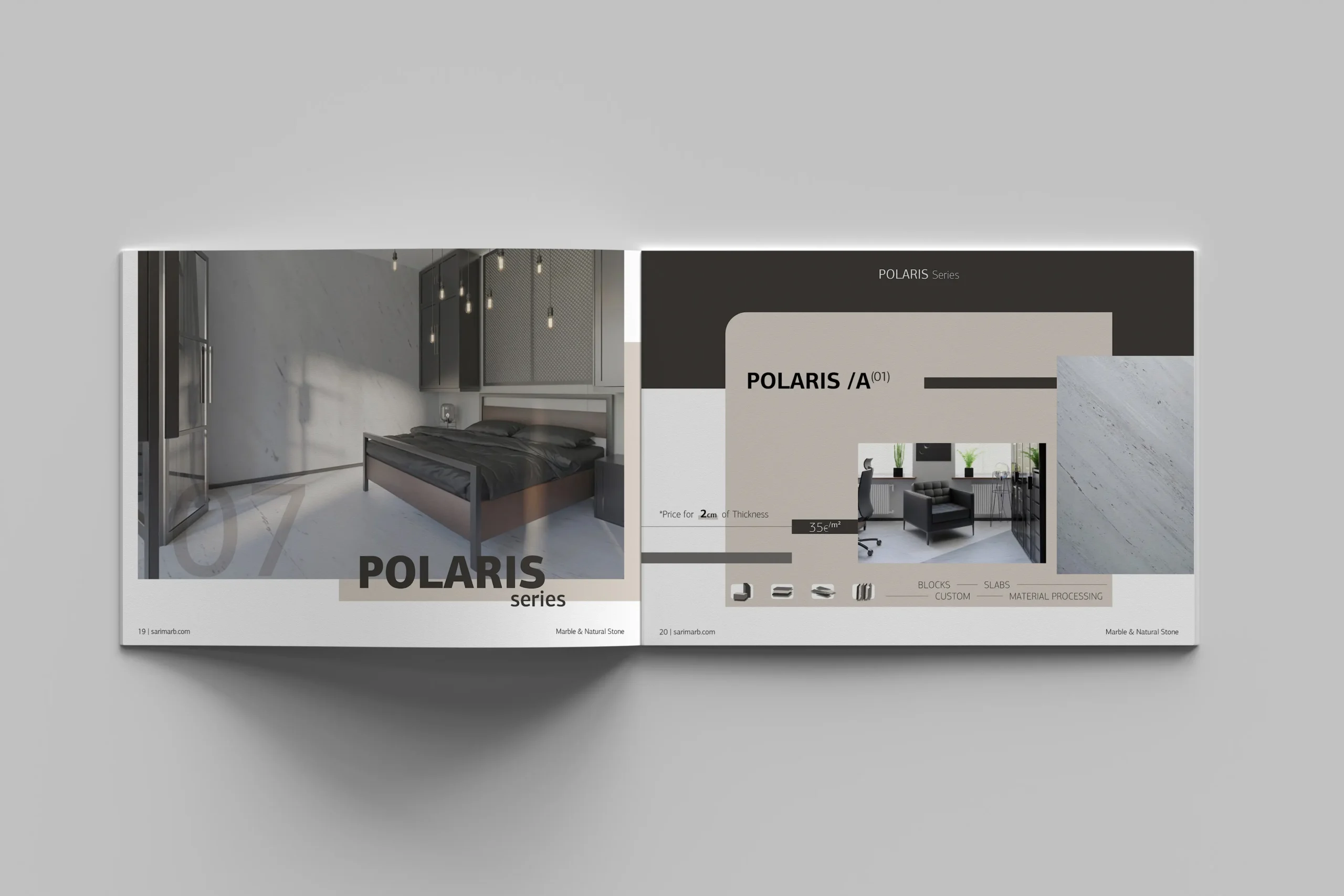
Color System
The brand’s palette draws from the natural qualities of stone and earth.
- A rich gold-bronze tone highlights the company’s depth of experience and its connection to high-quality raw materials.
- Charcoal black and warm greys add contrast and evoke the textures of marble and granite.
- A subtle use of beige balances the palette and brings an understated, grounded quality.
Together, these tones communicate strength, refinement, and a link to the natural origins of the product.
Outcome
The final identity gives SARIMARB a strong, memorable presence that connects classical Greek heritage with a clear contemporary visual language. It is designed to be adaptable across print, packaging, digital platforms, and architectural applications ensuring visual consistency as the brand continues to grow in domestic and international markets.
/ Related Projects